Makeshift: A Filmmaking Journey with Coca-Cola Refreshing Filmmaker Award Finalists
Do you remember when you stumbled upon something truly extraordinary, something that felt like a blast from the past? Well, we’re about to take you on a nostalgic trip back to a remarkable moment in our filmmaking journey during our time at the Savannah College of Art & Design.
It all began when our film, “Makeshift,” a Coca-Cola Refreshing Filmmaker Award Finalist, was still just a concept brimming with creativity and youthful enthusiasm. Our team, comprised of talented individuals who shared a passion for storytelling, embarked on a mission to bring this project to life.
The Plot Unveiled
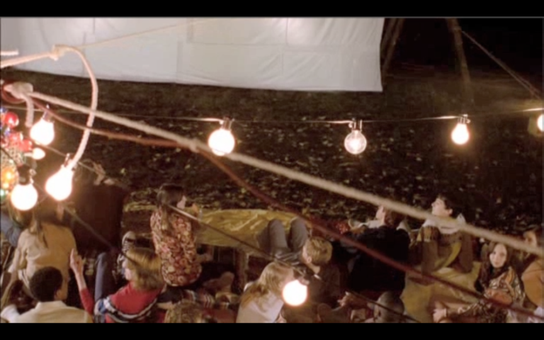
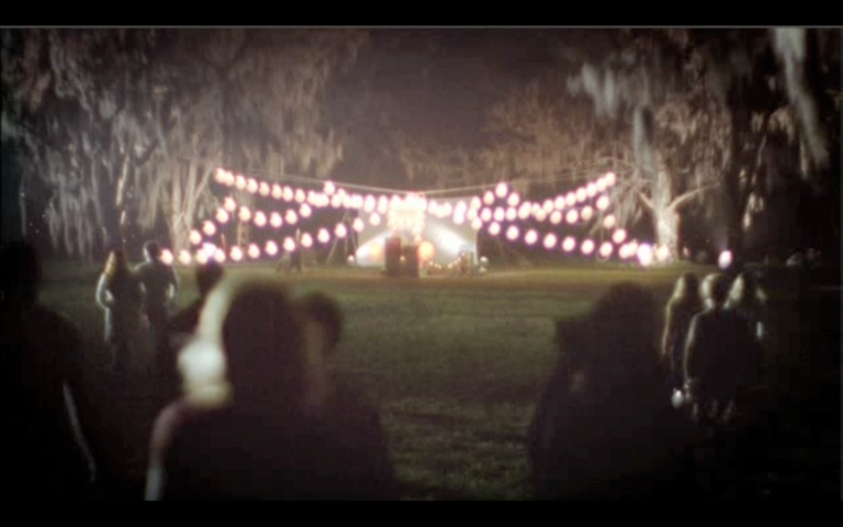
The heart of our commercial revolves around a young man who stumbles upon a group of friends in an open field. Seizing the opportunity to spread joy and excitement, he transforms this simple field into a magical pop-up movie screening. Picture this: a makeshift concession stand, a movie screen, and an old-school film camera all coming together under the summer sky. It’s a story that captures the essence of youthful spontaneity and the joy of creating memorable experiences with friends.
Behind the Scenes
Every great film requires a dedicated crew, and ours was no exception:
Broody Carmikell – Director: The visionary behind the camera, Broody brought our story to life with his exceptional directing skills, ensuring that every frame was infused with the magic of the moment.
Zach Graber – Director of Photography: With an eye for capturing the perfect shot, Zach skillfully crafted the visual narrative, ensuring the essence of summer and camaraderie shone through.
Joshua Green – Production Designer: Joshua was instrumental in setting the stage for our pop-up movie experience, meticulously designing the set to evoke nostalgia and wonder.
Yolande Thame – Set Dresser: As the set dresser, Yolande added the final touches that made our creation feel inspirational and relatable. Her attention to detail breathed life into our project.
Creating Magic on Set
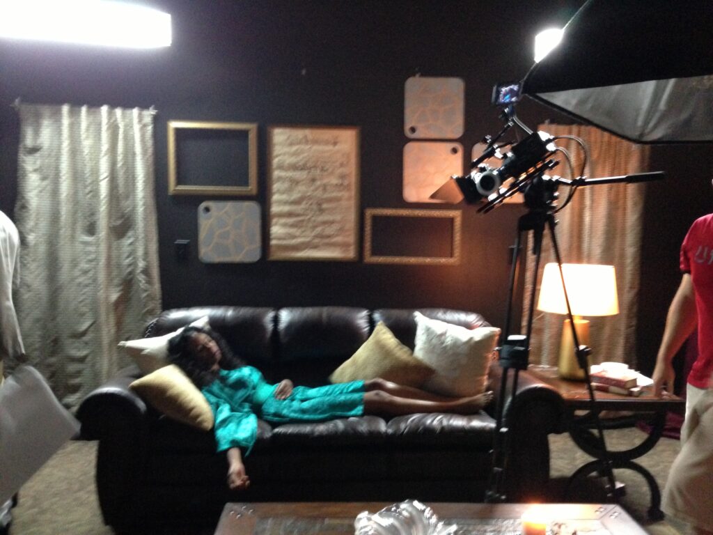
Dressing the set was a task that brought us immense joy. We wanted our audience to feel the nostalgia and excitement that the characters on screen were experiencing. From the retro concession stand filled with iconic Coca-Cola bottles to the warm, inviting glow of the makeshift movie screen, every element was carefully chosen to create a sense of wonder.
Conclusion
Our film, “Makeshift,” a Coca-Cola Refreshing Filmmaker Award Finalist, was not just a project; it was a journey filled with passion, creativity, and the joy of filmmaking. It reminds us of the power of spontaneity, the importance of creating unforgettable moments, and the magic that happens when a group of talented individuals comes together to tell a story.
So, as you sip on your Coca-Cola and reminisce about those timeless moments, remember that “Makeshift” captures the magic of the past and brings it to life on the silver screen. Cheers to the power of storytelling and the memories that last a lifetime!
Crafting the Spaceship: My Journey in Design for “Phoenix Beyond”
As I embarked on my master’s program at the Savannah College of Art and Design, I never anticipated the incredible journey that awaited me. It was during this time that I had the opportunity to contribute to a remarkable project – the creation of a spaceship for the short film “Phoenix Beyond.”
The film’s storyline, directed by Neil Short, revolves around a young man trapped in a monotonous daily routine within the confines of a spaceship. His mundane existence is disrupted when a fellow shipmate lures him outside, revealing the shocking truth: their spaceship is, in reality, an observation pod housed within a warehouse. The project was a testament to the transformative power of film and the art of set design.
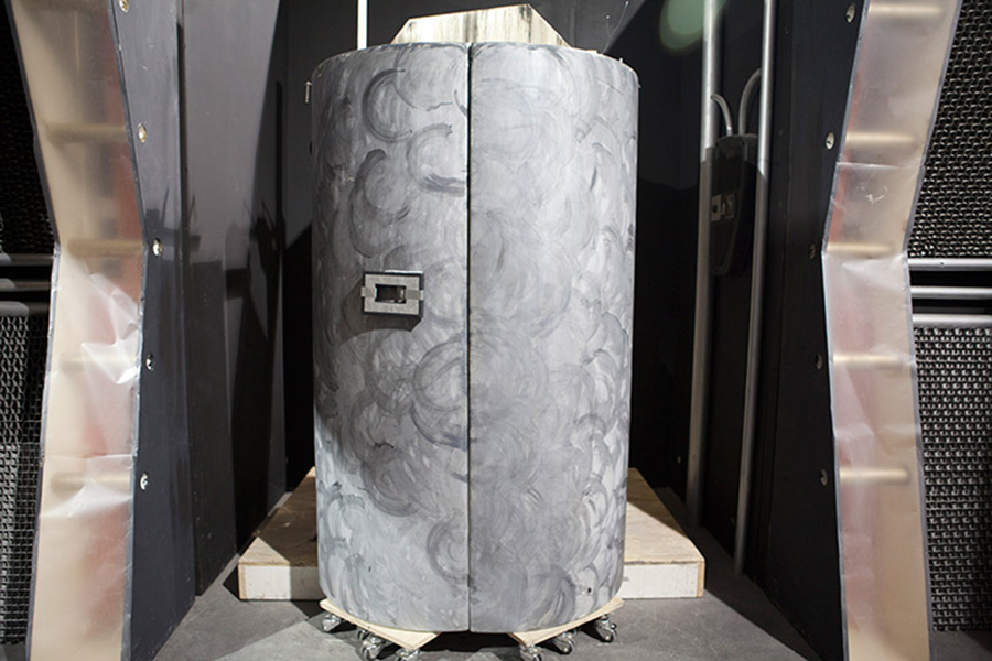
Creating the spaceship itself was a monumental task that took an entire month and a dedicated team of students. We were faced with the challenge of bringing a futuristic and enigmatic environment to life. The design was influenced by the intricate structure of a hexagonal hive, creating a visually captivating yet eerie aesthetic. To add an extra layer of suspense, we incorporated a sickly green tint, subtly hinting to the audience that something was amiss.
What I quickly learned through this experience was the critical difference between designing for film and theater. In the realm of film, every detail is meticulously examined, as the camera captures even the smallest nuances. Scenic techniques that might work seamlessly on a theater stage can be far less forgiving when a camera lens is involved, making precision and attention to detail paramount.
The process was not without its challenges, from scaling the 30-foot ladders to address every minute detail, to navigating the complexities of film production, which often meant working long hours with little sleep. It was a journey that tested my limits but also solidified my passion for design.
“Phoenix Beyond” was not just a film; it was a testament to the power of storytelling through visual elements. It was a journey of creative discovery and collaboration, a testament to the dedicated individuals who poured their talent and hard work into bringing this science fiction tale to life.
Reflecting on my experience with “Phoenix Beyond,” I am reminded that creativity knows no bounds and that the pursuit of design can lead to revelations about the subtle nuances that can bring a story to life on screen. It was a transformation journey, both for the characters within the film and for me as a designer.
Reminiscing on a Journey Through Set Dressing: “Mort” – The Short Film That Holds Memories
Now and then, revisiting a piece of work from the past can be a walk down memory lane. I recently stumbled upon a little gem from my time at the Savannah College of Art and Design, a short film that I had the privilege of contributing to as a set dresser. The film, “Mort,” directed by David M. Davis and with the artistic touch of production designer Miranda Frederick, offered a poignant narrative that left a lasting impression on everyone involved.
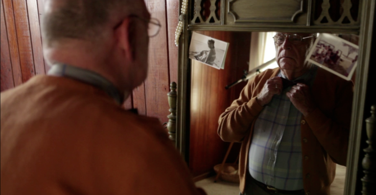
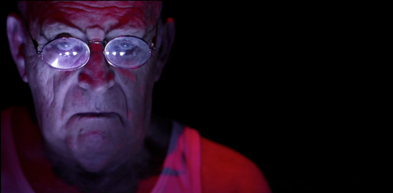
The storyline was a unique blend of fantasy and emotion, focusing on the encounter between an older man and his grim reaper. As he faces his mortality, the film takes us on a journey of self-discovery and acceptance.
Set dressing for this project was an exciting challenge. It was not just about creating a visually striking environment; it was about crafting a space to convey the complex emotions and themes at the heart of the story. Every piece and every detail played a role in telling the narrative.
As I look back on this experience, I can’t help but feel a wave of nostalgia. It was a time of creative exploration, filled with late-night discussions and collaboration with talented friends and colleagues. Working on “Mort” was not just about the final product; it was about the journey, the shared passion for storytelling, and the bonds formed during its creation.
Today, I’m excited to share the trailer of this remarkable short film, a token of the hard work and dedication poured into it by a group of passionate individuals. It’s a reminder that creativity knows no bounds and can touch the hearts of both creators and audiences alike. As the tagline suggests, it’s a story about coming to terms with the end of life and the start of something unknown.
So here’s to the memories of “Mort” and the friends I made along the way. It’s a testament to the enduring power of storytelling and the magic that happens when creative minds come together to breathe life into a narrative.
Creating a Vampire Lair of Redemption on a Shoestring Budget
In the realm of independent filmmaking, creativity often takes center stage, turning limited resources into opportunities for innovation. This is precisely what we set out to achieve with the short film “Upyri.” With a shoestring budget, I embraced the role of art director to bring this vampire tale to life.
Synopsis
“Upyri” is a tale of redemption woven with elements of vampire mythology. At its heart, it revolves around Hubris, the enigmatic leader of the vampiric clan E’pohvul. Hubris’s character is driven by his insatiable thirst for blood and his quest for power, which are in constant conflict with the remnants of his human nature buried deep within.
In the world of “Upyri,” virgin blood holds a sacred significance, as it possesses the potential to enhance the abilities of those who partake in it. Hubris and his coven, including Invidia, Delilah, Thumps, Mammon, Morgans, and Pharos, are on a quest to find a unique virgin whose blood can grant them the ultimate power – the ability to reshape humanity in their own vampiric image.
Art Direction on a Budget
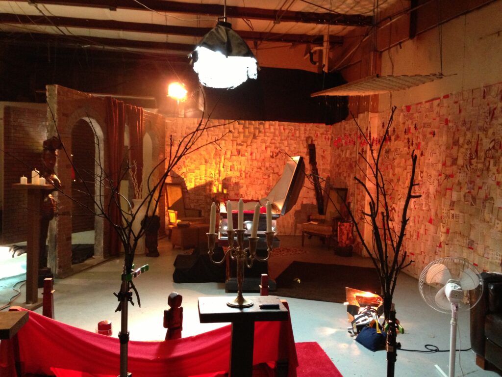
Faced with financial constraints, I embraced the challenge of creating a compelling and visually striking setting for our characters. One of the most remarkable aspects of this project was the development of a low-budget Vampire Lair. Here, my creative vision came to life.
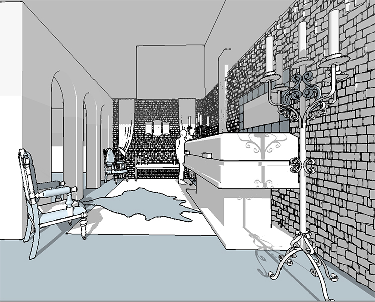
The Vampire Lair, intended as Hubris’s plotting chamber, became an evocative space filled with symbolism. We achieved this by layering postcards resembling ancient notes, over vibrant red-painted walls. The notes bore enigmatic symbols, hinting at the characters’ intentions and desires.
Additionally, we incorporated painted chess pieces into the design to symbolize the intricate plotting and strategy undertaken by Hubris. The chess pieces served as visual metaphors, representing the complex power dynamics and internal struggles of the clan.
As an art director, I relished maximizing the impact of the minimal resources available to us. The result was a Vampire Lair that felt immersive and thought-provoking, despite the budgetary constraints.
In collaboration with director Byron Erwin and director of photography Christian Monckeberg, we brought the world of “Upyri” to life. This project exemplified the boundless potential of creative storytelling, even in the face of limited means. It’s a testament to the power of imagination and resourcefulness in independent filmmaking.
“Upyri” stands as a testament to the magic that can be conjured when passionate filmmakers come together, driven by their shared love for storytelling and a willingness to take risks, even when working with the most modest of budgets.
The Colorful Grandeur of ‘The Adventures of Robin Hood’
In my twenties, I was utterly baffled by the critical praise for “Glorious Technicolor.” My only experience with the process was watching Nick-at-Nite trailers, which could never substitute for a theatrical screening. Honestly, I don’t even remember watching The Adventures of Robin Hood all the way through. So, I’m not afraid to admit that I was jumping around with glee while reviewing this film…seriously, I did not sit down. The saturation level in Adventures of Robin Hood was astonishing. Colors simply burst out of the screen and contemporary films like Run Lola Run, Limitless, or anything from Tim Burton or Terry Gilliam. From the parchment paper opening credits with their specially designed Warner Brothers shield, I was sold hook, line, and sinker…oops the wrong story.
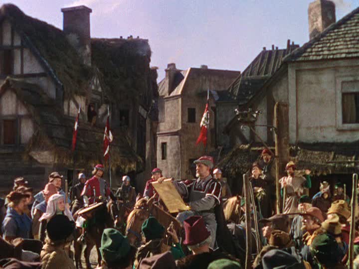
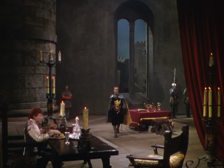
Let’s start in the town square where the royal messenger read news of King Richard’s capture by Leopold of Austria. Half-timbered style buildings, with their plaster, infilled exposed beams, framed the crowd and placed audiences on a sympathetic level with the townsfolk. The communal setting starkly contrasted with Nottingham castle’s barren stone walls, where Prince John forms his anti-Saxon plot. Compositionally, this started a trend where frames outside the castle were claustrophobically filled with people and activity but dialog inside showed extreme depth (instead of having actors shelled against walls). The scenic masonry walls were painted to perfection and punches of royal-red fabric made the eye jump from one side of the screen to the other. And just in case you missed it, when Prince John spills his wine, the dripping, crimson liquid is a not-so-subtle hint of the carnage to come.
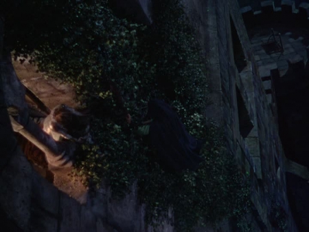
There were a few scenic missteps, like the rock formation from which Robin orated to his Saxon townspeople. It was a prop because the surface showed little sign of weathering or mossy overgrowth. However, many other elements carried the film to soaring heights. The matte paint drops (ex. exterior castle top or below Marion’s window) were the most expressionistic I’ve seen. I was captivated by the banquet hall’s working fire-pit, iron rivet doors, and all the rusted candelabras. Longbows, swords, and quarterstaffs (the name refers to hand position on the pole) were used with precision during the numerous friendly and not-so-friendly fight scenes. Also, I could think of several alternate decorative uses for Robin’s handsome, leather, arrow bag.
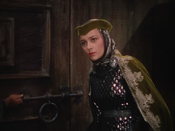
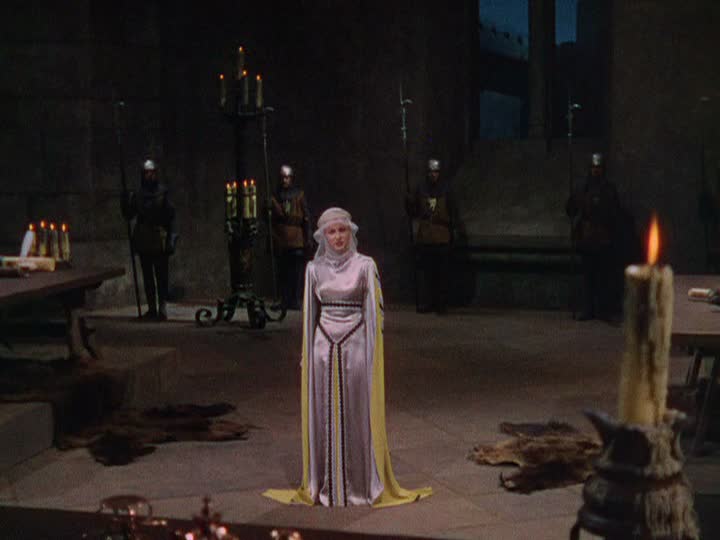
The Adventures of Robin Hood was switched from black and white to Technicolor at the last minute, so the wardrobe was designed with punchy contrast. The costumes in the film are inventive, tactile, and vibrant. They also gave me further insight into how art department designers achieved their tonal variety historically. Maid Marian’s constantly changing wardrobe remained a fictional, shimmering delight. Although choosing favorites would be impossible, costume high points for me were her archery contest glider, the garb worn in the Merry Men’s tavern, and her silver/yellow satin gown during her trial. The men were equally as graceful. Sir Guy of Gisbourne’s suede, emerald, poca-dot tunic worn while sending a henchman to kill King Richard was commanding.
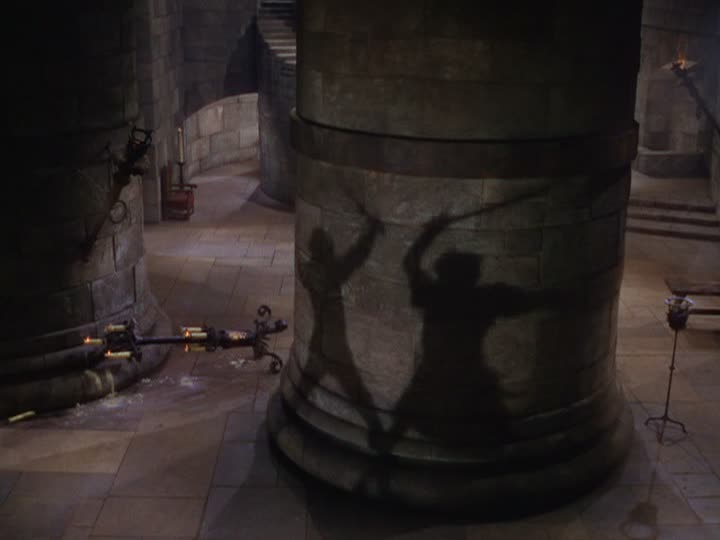
Lighting was unmotivated throughout the film but I didn’t care because the depth was so rich. Many scenes were filmed day for night, but cuts sporadically missed their blue lighting cues (especially studio process shots). One lovely forest scene, as Robin Hood escaped Prince John’s celebratory dinner, had stark moonlight streaks raining through dense oak tree branches. Director Michael Curtiz, also seemed to favor action playing out in silhouettes on the massive, block walls. Some famous examples shaded Prince John’s order to forfeit Locksley Estates and grazed the last battle between Robin and Sir Guy.
Despite switching directors mid-way through (Keighley-outdoor scenes, Curtiz studio shooting), Adventures of Robin Hood was a narratively vibrant piece of cinema. The film captured the pageantry of the period and added new zest and wonder. The Adventures of Robin Hood managed to stay faithful architecturally but pushed boundaries with their costumes’ textures and colors. It whole-heartedly deserved seven out of ten scenic fitches.
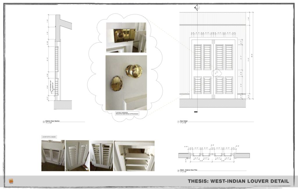
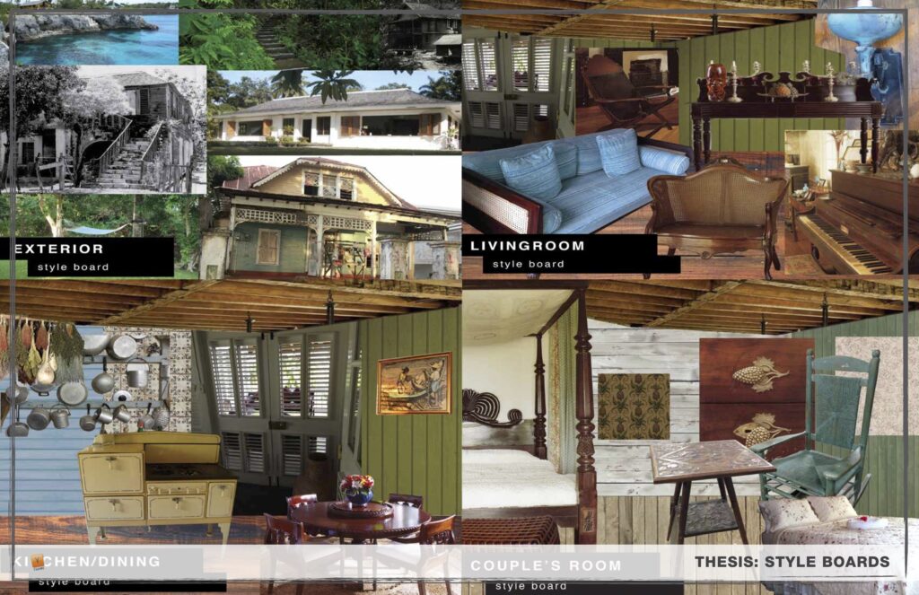
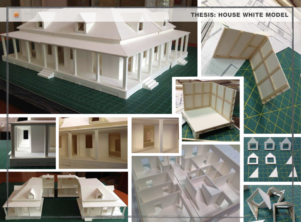
Crafting Dreams: A Journey into the MFA Thesis Project
Venturing into the realm of an MFA thesis project is like embarking on a profound artistic odyssey. It’s a voyage that delves deep into one’s creative spirit, pushing the boundaries of imagination. Today, I’m thrilled to share a glimpse of my SCAD Production Design MFA thesis project, an exploration that took me on a transformative journey through the enchanting world of cinema.
Plot:
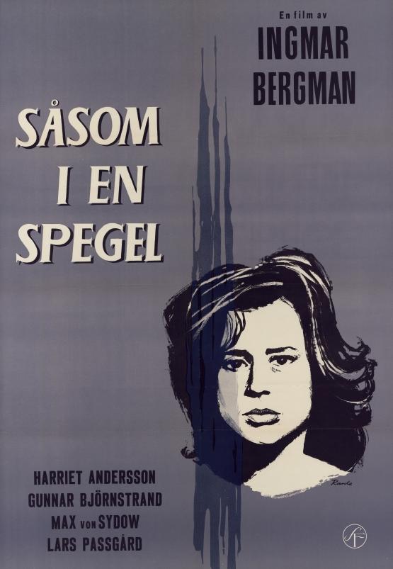
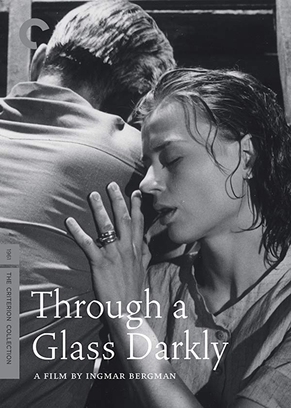
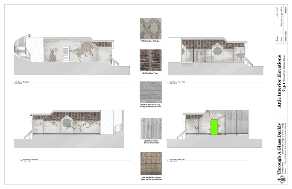
My journey began with the reimagining of Ingmar Bergman’s iconic film, “Through a Glass Darkly” (1961). This psychological masterpiece tells the story of four family members on a remote island vacation, focusing on Karin, who has recently been released from a mental institution.
Adaptation:
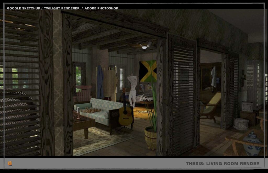
My mission was to infuse this narrative with a fresh perspective, moving the story from its original European setting to the vibrant tapestry of Jamaica. In this reimagining, a Jamaican family returns to their island home after migrating from Manchester, England, just before colonial emancipation in 1962. The house, once a place of refuge, had been locked up for several years, partially reclaimed by nature. Karin, entrusted with the task of revitalizing the space, grapples with her inner demons and experiences vivid hallucinations.
THE Concept:
The House:
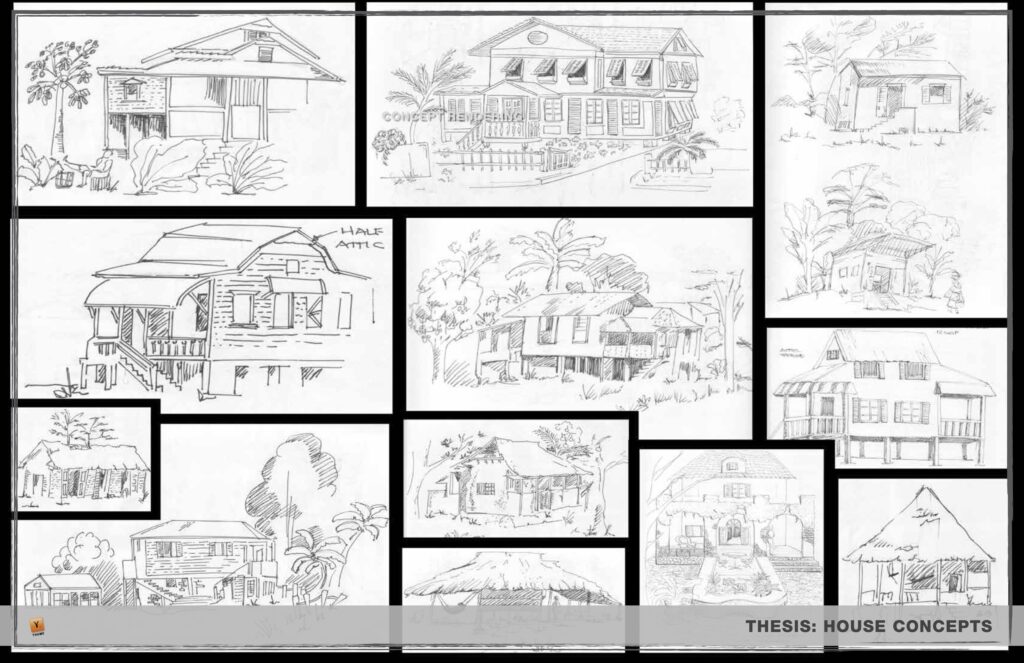
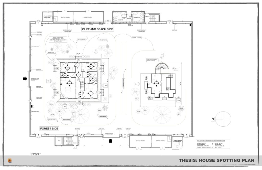
Central to the project was the transformation of the sprawling plantation house, slowly being devoured by the encroaching forest. Its faded, dry color palette symbolized its vulnerability and the toll of domestic life on Karin’s mental state. The wrap-around porch’s spindly columns hinted at the family’s French Creole heritage, leaving them exposed to the elements and one another. Inside, the house was a chaotic mix of colonial furniture, ancestral keepsakes, travel memorabilia, and symbols of island pride, reflecting the struggle to reconcile cultural and personal traumas.
Fantasy:
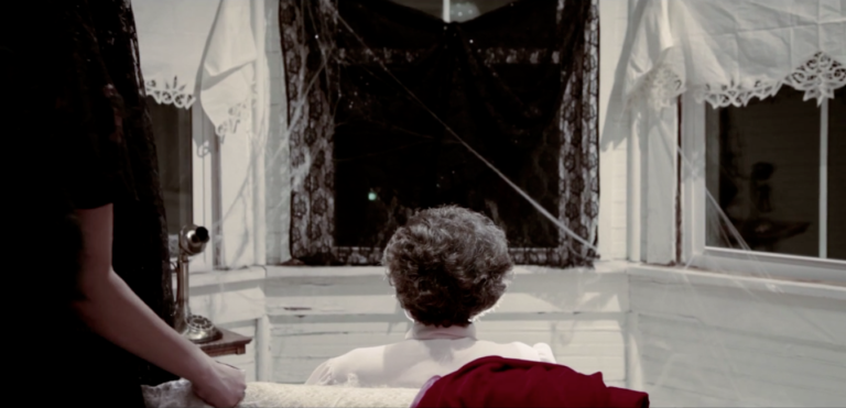
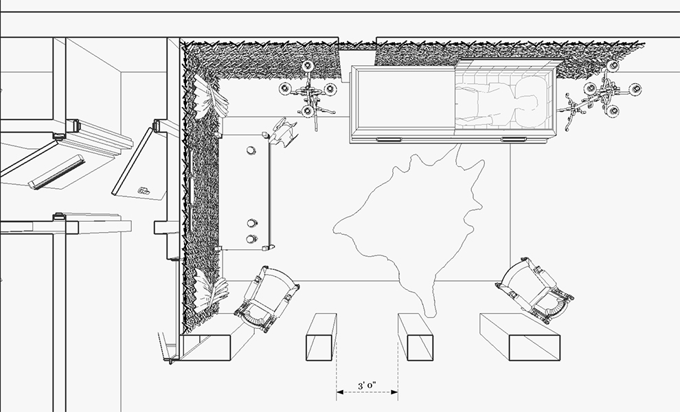
Karin’s hallucinatory journey led her to a dramatic Gothic-influenced hall where she confronted her deepest fears. High ceilings, obscured by undulating rosary windows, seemed to slither up the walls. Spider-like tendrils held antique wooden furniture in suspense, poised to move at any moment. In the center of this surreal space, icy water encroached from the flooded exterior, while luminous capsules containing matriarchal symbols floated in a wading pool. Karin’s interaction with this space initiated a profound transformation, shaking her psyche and the chamber itself.
The journey I undertook in this MFA thesis project was an exploration of storytelling through the lens of production design. It allowed me to reimagine a classic narrative, blending elements of the original with fresh perspectives and cultural nuances. The resulting vision was a vivid tapestry of colors, textures, and emotions that transcended the boundaries of traditional cinema.
This project is a testament to the power of art direction in shaping narrative experiences, making it an unforgettable chapter in my artistic journey. While I can’t share the entire 150-page paper today, these presentation slides provide a glimpse into the world I crafted, bringing Bergman’s classic into a new light.
In crafting dreams and giving life to imaginative landscapes, I’ve discovered the boundless potential of storytelling through art direction.
Cimarron Chronicles: A Land Rush Through the Eyes of Art Direction
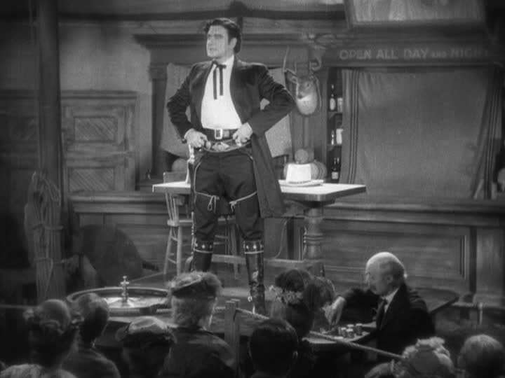
Before delving into the brass tacks of “Cimarron,” it’s essential to express a few personal reflections. The rapid shift from silent films to synchronized talkies in just over a year is nothing short of awe-inspiring. It’s a testament to human ingenuity. Secondly, despite the film’s troubling portrayals of marginalized groups, it surprisingly emerges as a captivating piece of cinema history, with moments that left me laughing out loud. Lastly, I can’t help but believe that Yancey Cravat served as the blueprint for Elvis Presley’s persona, from the wavy locks to the cocky demeanor.
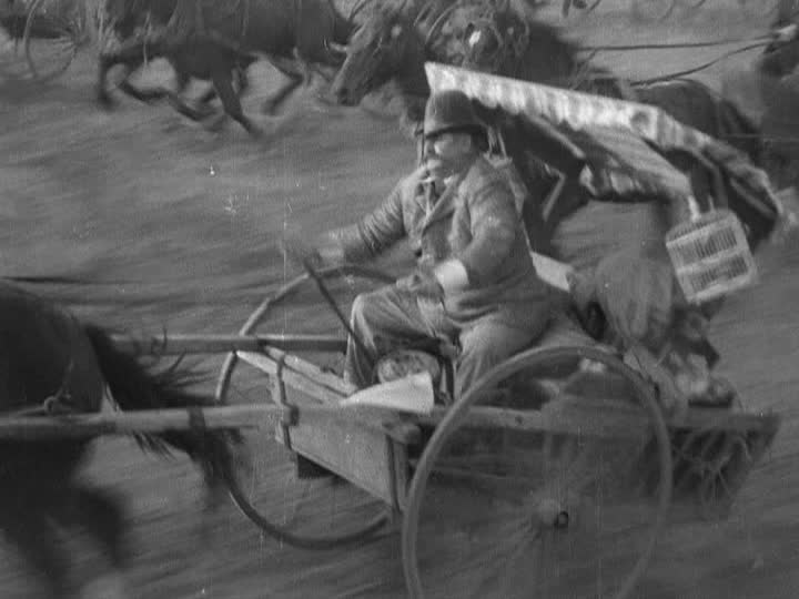
Now, to the artistic assessment. Max Rée’s creation of the 1889 Indian Oklahoma Lands is a world I would have enjoyed living in if it weren’t for the glaring prejudices and injustices depicted. The film brims with energy, much credit to cinematographer Edward Cronjager. The scenic design, a colossal undertaking for its time, merits top marks for believability. The land rush scenes whisk viewers into the excitement of claiming territory that wasn’t rightfully theirs. Director Wesley Ruggles wisely uses static aerial views to mark the passing years in Osage’s main market street.
What stands out most is the attention to detail. Hand-painted signs, battered barrels, and canvas tents fill the scenes, creating a vibrant and layered world. The transformation of the Carvats’ family home mirrors the town’s evolution, capturing the spirit of carving success in an uncharted landscape. The film’s rich, nuanced visuals, even in silence, convey its essential themes.
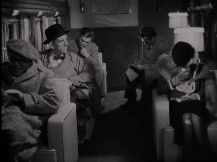
The Douglas DC2, prominently featured in the film, is a stunning example of the early days of commercial aviation. This sleek classic transport, rented from American Airlines, provided an exquisite backdrop against the rugged mountain landscapes. The plane’s interior, meticulously recreated on a soundstage, exudes luxury, riveted leather, and warm wood paneling, making it a highlight of the film’s set design. Even the intricacies of the cash register at Grat Gotch’s Hall of Chance add a layer of authenticity and delight to the scenes.
While “Cimarron” may have its shortcomings, particularly in its portrayal of marginalized groups, it excels in its scenic design. The film transports viewers to a bygone era, capturing the energy and excitement of a land rush, and providing a meticulously detailed world. For these reasons, “Cimarron” certainly earns its place as a captivating piece of cinema history, despite the blemishes. In our exploration of its scenic elements, it secures a solid seven out of ten scenic fitches.
Lost Horizon (1937): A Scenic Odyssey Through Shangri-la
In Frank Capra’s “Lost Horizon” (1937), a journey from the bustling streets of Baskul, China, to the mythical haven of Shangri-la unfolds. While the film carries a mix of delights and disappointments, the scenic design leaves an indelible mark on the viewer.
Capra and cinematographer Joseph Walker deserve commendation for their visual storytelling prowess. The clarity, lighting, and frame compositions, especially in Shangri-la, offer a visual treat. Multi-camera setups enhance the capture of actor reactions and dramatic sequences, elevating the cinematic experience.
The film’s portrayal of the Douglas DC2, the aircraft for Robert Conway’s expedition, is a visual standout. The plane, rented from American Airlines, is given ample screen time and shines against the mountainous backdrop. Its interior, created on a soundstage, exudes luxury with riveted leather, wood paneling, and glass-ball lamps. The cabin’s spacious feel and dynamic camera work make it a memorable part of the film.
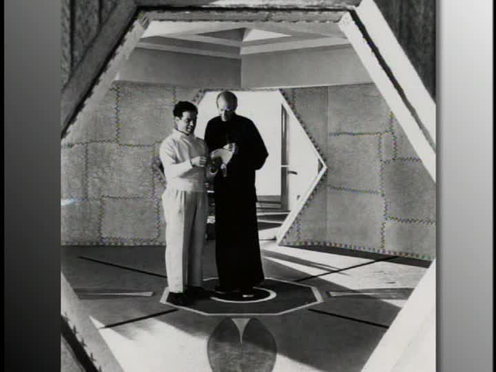
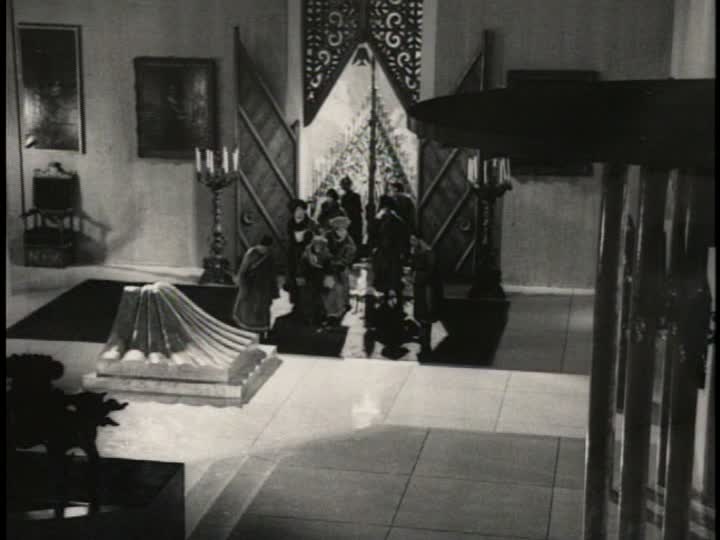
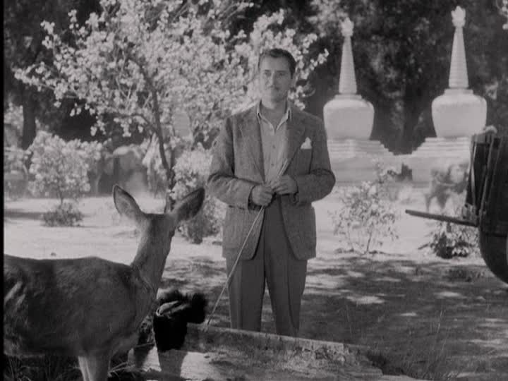
However, as the narrative transitions to the Himalayan utopia, the scenic elements take an unexpected turn. The lamasery lacks the traditional architectural motifs of Tibetan temples, leaving a void in authenticity. While Goosson’s attempt to blend architectural styles and incorporate Asian elements is intriguing, it sometimes feels disjointed.
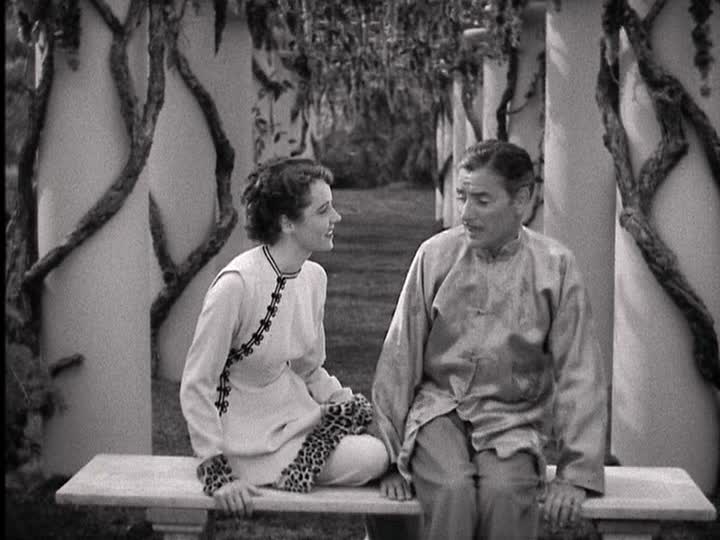
The film introduces a dream-like aura, but the disparate designs occasionally detract from the overall experience. Star Trek-like doors, tufted interior walls, and leopard-fur wrist cuffs challenge the film’s cohesion.
In spite of these aesthetic challenges, “Lost Horizon” remains a massive production undertaking that largely succeeds. The scenic design, though not without flaws, contributes to the film’s unique atmosphere. In the end, “Lost Horizon” earns a rating of five out of ten scenic fitches, a testament to its ambitious scenic endeavors.
“The Tempest” (1928): A Scenic Odyssey in Imperial Russia
Directed by Sam Taylor and featuring art direction by William Cameron Menzies, “The Tempest” (1928) offers a visual journey through the stark yet enchanting setting of Imperial Russia in 1914. The film’s art direction crafts a captivating backdrop for the characters’ evolving journeys.
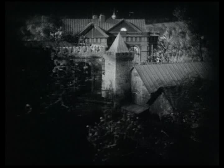
The opening scenes gracefully sweep over regal residential buildings and stone monasteries, setting the stage for what’s to come. The attention to detail becomes evident as the camera pans over the wooden cladding of a dilapidated peasant barracks, seamlessly transitioning from one setting to another. This meticulous assembly of the middle and background draws viewers into the story.
Amidst this richly layered backdrop, we follow Ivan Markov, portrayed as a dedicated man more concerned with his task than his comfort. The wood-paneled interior of his study exudes simplicity and functionality, reflecting his character’s principled nature. The room’s realism subtly contrasts with elements like painted wall flats and scattered leather-bound books, adding depth to the character’s portrayal.
In contrast, the grandeur of the General’s quarters is a testament to aristocratic opulence. Lofty arches, gilded thrones, and towering ceilings underscore the stark contrast in social status. The examination room, where we meet the heroine, features platform tables that inspire respect for those seated upon them. The scenic design effectively underscores the contrast between Ivan’s humble origins and the ostentatious world of the aristocrats.
Princess Tamara’s room provides another visual treat with its lush, tactile qualities, from the silky canopy to geometrically tiled floors. It reflects her pampered life, contrasting sharply with the invasion of feelings brought on by her interactions with Ivan.
The scenic design beautifully supports the story’s emotional arcs and establishes a visually complex world. While competent in its portrayal of 1914 Russia, “The Tempest” might not dazzle with groundbreaking design elements. However, it successfully weaves the characters’ stories into the rich tapestry of their surroundings.
In the end, “The Tempest” receives a respectable rating of four out of ten scenic fitches, a testament to the film’s dedication to setting the stage for the characters’ transformative journeys.
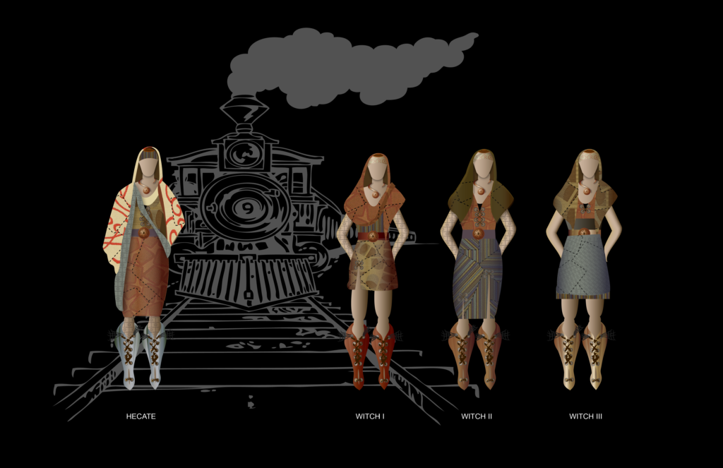
In the dark and twisted world of a post-apocalyptic Macbeth, where new societies arise in the ruins of underground railways, the spotlight shifts to costume design. At the heart of this transformation are Hecate and her three witches, reimagined as mysterious and alluring figures.
The concept was to craft costumes that told a story of resourcefulness in the face of desolation. The witches’ attire is a testament to their ability to adapt and thrive amidst chaos. They’ve ingeniously repurposed the interior upholstery fabric of abandoned subway trains, fashioning it into unique garments that blend beauty with the eerie. Metal buckles and salvaged train parts adorn their outfits, serving as a stark reminder of the world they inhabit.
What sets these witches apart is their allure, a trait that goes beyond the usual portrayal of their kind. Their enchanting appearance conceals the grit and decay of their underground existence, making them more than meets the eye. In a world where darkness and despair reign, these witches shine with an otherworldly charm that draws you into their spell.
This bold reimagining of Macbeth showcases the power of costume design to breathe new life into a timeless classic. It proves that even in the bleakest of settings, creativity can flourish, and the allure of artistry transcends the boundaries of the stage. The post-apocalyptic witches of Macbeth are a testament to the enduring magic of storytelling, where the right costume can transform characters and transport audiences to a whole new world.