There is a version of cultural specificity in film that functions as decoration. It arrives late in the process — in the props, in the costume accents, in the music choices — layered over a design language that was never built from the culture in the first place. It is recognizable. It has a particular quality of surface enthusiasm without structural commitment. The culture is present but it is not load-bearing. It's not respectful.
I have spent enough time on enough sets to know the difference immediately. And I have spent enough time thinking about why the gap exists to understand that it is almost never the result of bad intentions.
The gap is a timing problem.
Cultural research that actually shapes a design has to happen before the design begins. It has to inform the geometry, the material palette, the proportions, symbols, the logic of how spaces connect to each other. By the time a production is in build, the structural decisions have already been made. What is left is surface — and surface, however carefully chosen, cannot carry the weight of what the earlier decisions failed to establish.
On the Commonwealth Youth Programme virtual museum, I chose the honeycomb as the organizing structure not because it looked interesting but because it made a spatial argument: every cell equal, every cell necessary, the whole structure weakened by the absence of any one piece. That is a political statement about Commonwealth interdependence, embedded in the geometry. You cannot add that in post. It is either in the bones or it is not.
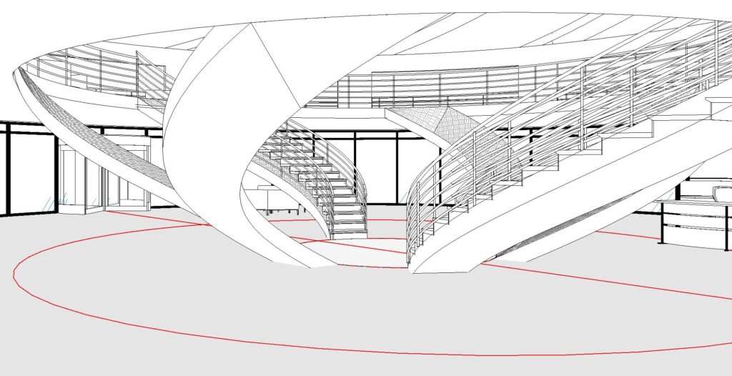
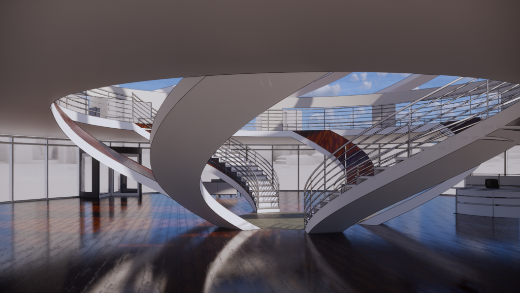
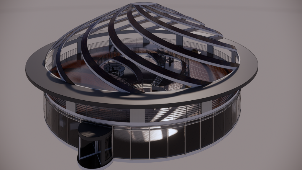
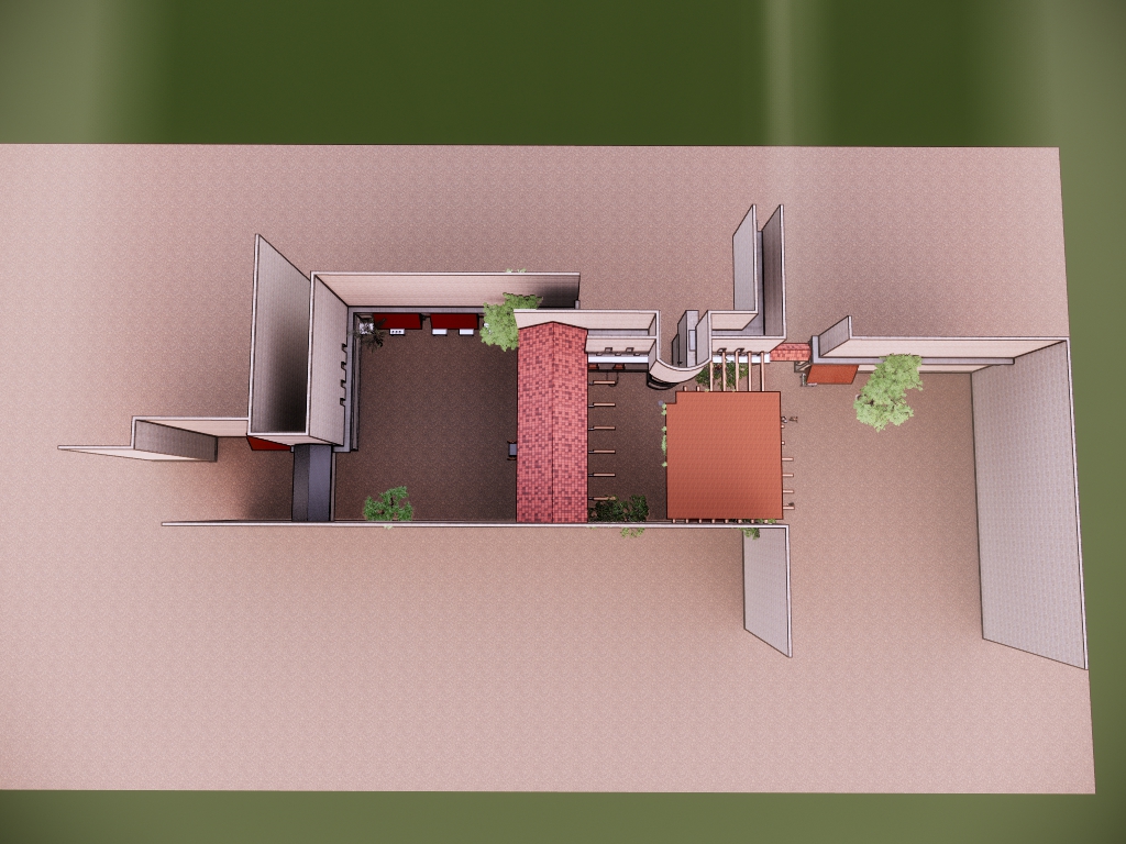
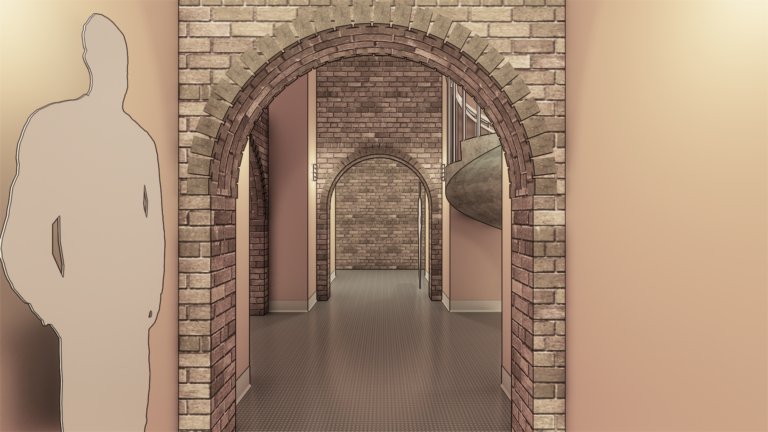
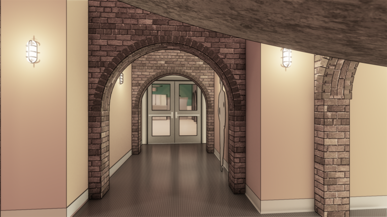
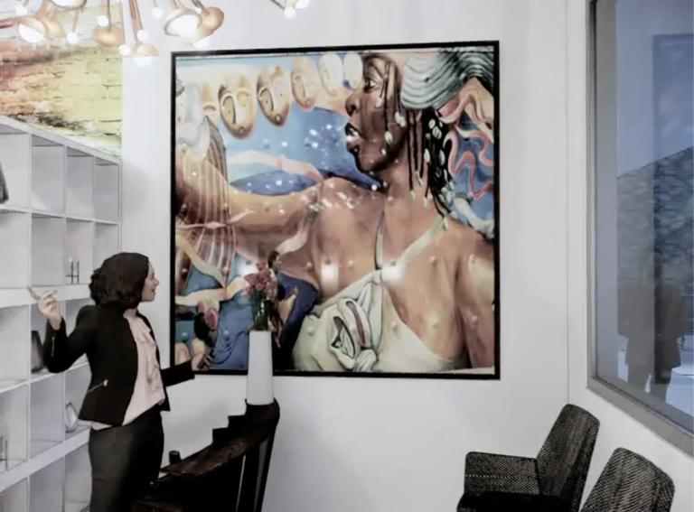
On the Museum of Diversity Jamaica, I used the fragments of a broken Taíno sun as the literal floor plan. The voids between fragments become courtyards. Visitors physically move through absence as well as presence. The incompleteness of Taíno history is not papered over — it is held in the architecture honestly. It's structure is based on a broken sun, a broken humanity. It's memory in many of our bodies expressed in architecture.
This is the difference between research that decorates and research that designs.
The question I ask at the beginning of any project is not: what does this culture look like? It is: what does this culture argue? What does it believe about how people should move through space, how they should encounter history, what should be visible and what should be protected? A spectacle hides meaning with glitz. How can I design memory in a respectful way? The answers to those questions generate a design language. The visual details follow from that. Not the other way around.
Cultural depth is not a checkbox. It is a discussion. It is a sequence. And the sequence has to start at the beginning.
What Jamaica taught me about permanence
A film set is, by definition, temporary. You build it, you shoot it, you wrap it. The most elaborate construction — a full-scale working kitchen, a period-accurate street, a virtual world built in Unity — exists to be photographed and then released. The camera captures what was there. The thing itself disappears.
I understood this as one of the defining conditions of set design. You build for the lens, not for time. The decisions you make are accountable to the frame, to the performance, to the director's vision for a specific moment. They are not accountable to the person who will stand in that space in twenty years and feel something about it.
Designing the Museum of Diversity Jamaica changed that understanding.
A museum is permanent. Or it is intended to be. The decisions made in the design of a museum — structural decisions, symbolic decisions, the choices about what the building says when it is simply standing there with no one in it — those decisions will be accountable to visitors for decades. Possibly longer. The designer's reasoning will not be present to explain itself. The building will have to speak on its own.
When commissioned to design a concept for the build, admittedly, I felt a heavy weight. I felt a deep responsibility to be true to not just the present culture, but to the past and how all-together the story we tell that will influence the future of the people for generations to come after me that will grace the halls and exhibits of this space.
The particular weight of the MoD Jamaica project was this: the museum is dedicated to Black and diaspora histories, and I chose to anchor it in the Taíno — Jamaica's first people, nearly completely erased through colonization. That is not a decorative choice. It is a statement about where Black diaspora history begins — not with the Middle Passage, but before it. Before the borders that colonization drew. The building's origin story starts in an earlier, deeper history, and it carries that argument in its structure.
Getting that wrong — romanticizing, appropriating, or simply misrepresenting what fragmentary Taíno history tells us — would not be a design mistake that wraps with the production. It would be embedded in a permanent institution, where it would repeat itself in front of every visitor, indefinitely. These visitors are people like me, and my people.
That accountability changes how you research. It changes how careful you are with the distance between what the historical record supports and what would be visually convenient. It changes your relationship with the people whose history you are working with. This is why when dealing with any culture outside your own, you must have the right people in the room, not the experts or the preferred who know nothing about the culture, but make the decision-makers and financiers comfortable. The very design is a nurturing of a relationship with the people.
What it does not change — what I did not expect it to change, but it didn't — is the creative instinct. The impulse to find the form that is true to the content, the geometry that makes the argument, the space that holds what it is supposed to hold. That instinct works the same way whether the thing you are building exists for six weeks of principal photography or for the next fifty years.
What changes is the stakes attached to it.
I think about this now as I work on writing. A film, once released, is also permanent in its own way — it exists, it can be seen, it accumulates meaning over time. The decisions made on the page are accountable to an audience I cannot fully anticipate, in contexts I cannot predict. The cultural material I am working with will be represented in whatever I make of it.
That is not a paralyzing thought. It is a clarifying one.
Jamaica taught me that permanence is not a reason to work more cautiously. It is a reason to work more honestly. To be more precise about what you know and what you are inferring. To make the argument in the structure, not just the surface. To build something that can stand without you there to explain it.
That is the standard I am trying to hold. On the buildings. On the page. On whatever comes next.
Set Designers: Balancing Act Between Film Production and Real-World Renovations
In the whirlwind world of film production, set designers often wear multiple hats. They must navigate the fast-paced demands of the industry, where time is a precious commodity, while simultaneously balancing their roles in the ever-evolving world of real-world renovations. This dynamic duality can be a challenging but rewarding aspect of a set designer’s career.
Film bosses, accustomed to the rapid pace of production, can experience “sticker shock” when confronted with the timelines and intricacies of real-world construction projects. It’s common for them to seek assistance from their trusted set designers for their renovation projects. This may include conceptualization, drawing alterations, or even full-scale design and project management.
The dichotomy of these roles requires a delicate balancing act. On the one hand, set designers must meet the industry’s demanding expectations, ensuring film sets are ready to beat the camera’s roll. On the other hand, they find themselves embroiled in renovation projects that require careful planning, attention to detail, and the patience to navigate the world of permits and regulations.
The demands of the film industry can be relentless, with set designers often working long hours to meet tight production deadlines. However, it’s in those moments when the pace slows down that the opportunity arises to explore side projects. These personal ventures can offer valuable modeling experience and present a chance to broaden one’s creative horizons.
The key to success lies in striking a balance. While film production remains the primary focus, these side projects can provide a rich source of learning and growth. They allow set designers to hone their skills, build relationships with vendors, and develop the ability to troubleshoot unforeseen challenges, all while maintaining a passionate connection to the world of design.
In the end, the journey of a set designer is a dynamic one. The ability to seamlessly transition between the demands of the film industry and the intricate world of real-world renovations is a testament to adaptability and creativity. By striking a harmonious balance, set designers can continue to thrive professionally and personally, embracing the ever-changing design landscape with open arms.
Mastering the Art of Raked Floors in Revit: A Cinematic Twist on Architectural Design
In the theater world, raked or sloped floors are a common sight. They serve a dual purpose: as a visual trick to manipulate perspective and as a subtle means to guide actors gracefully through a set. However, when it comes to film and television, raked floors aren’t as prevalent. Cameras prefer horizontal surfaces to glide upon smoothly. But today, I’d like to share a technique I recently remembered in Revit that allows you to achieve raked floors effortlessly.
The Revit Revelation: Creating Raked Floors
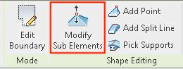
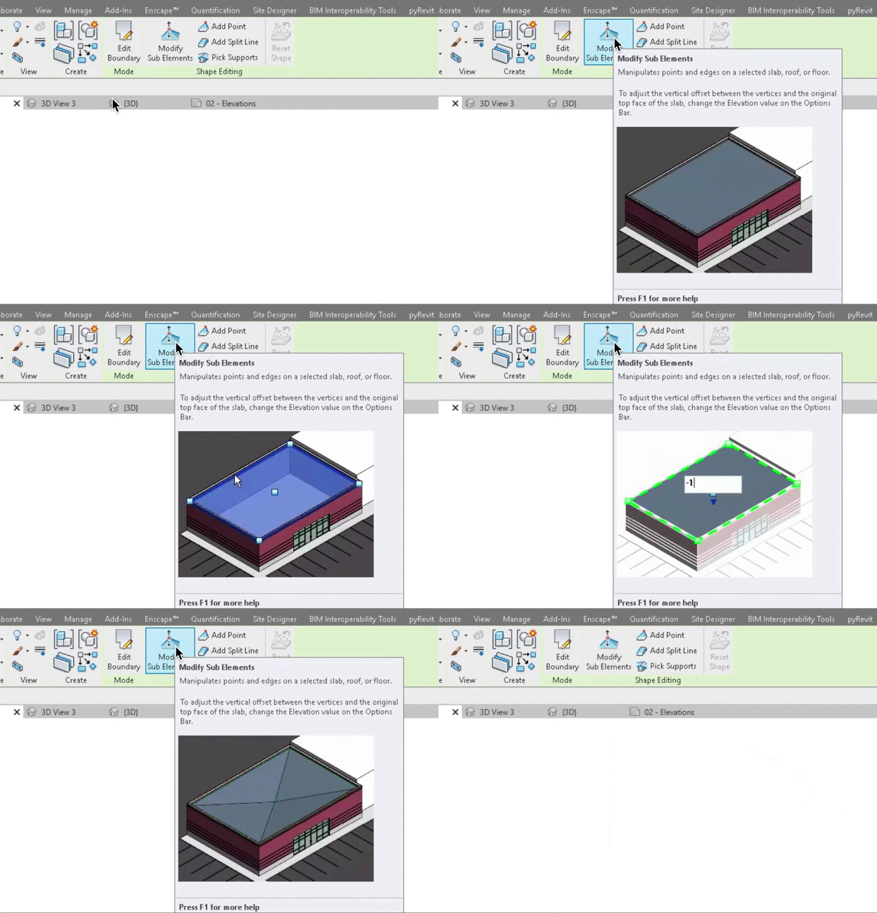
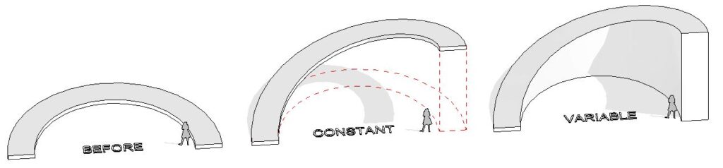
The process is surprisingly straightforward. It begins just like any other floor creation in Revit, but here’s where the magic happens. After creating and selecting your floor, look for the “Modify Sub Elements” button. This button grants you access to the vertices of your shape, giving you the power to create as many as you need. From there, you can adjust the height of each point or boundary line. The result? A floor that transitions smoothly, creating the raked effect you desire.
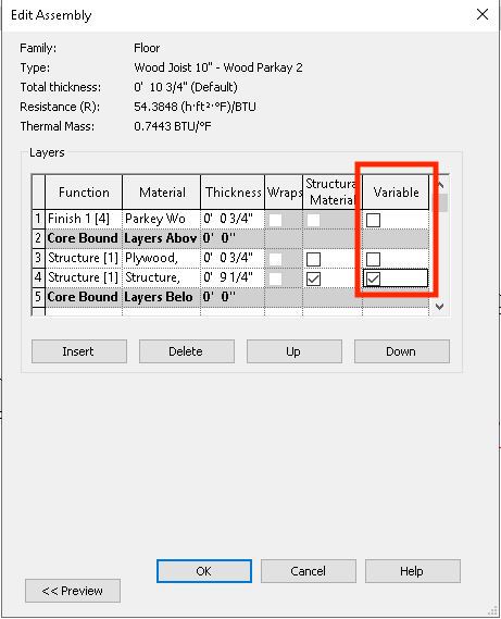
Now, you have some flexibility in how you execute this. You can maintain a consistent thickness for the floor or create a solid ramp-like structure. The choice is yours, thanks to the “variable” checkbox in your floor’s assembly properties.
Putting It into Practice: Curved Slopes
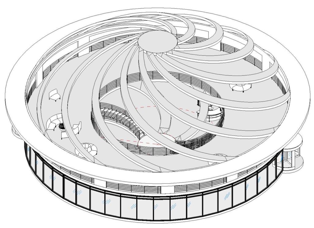
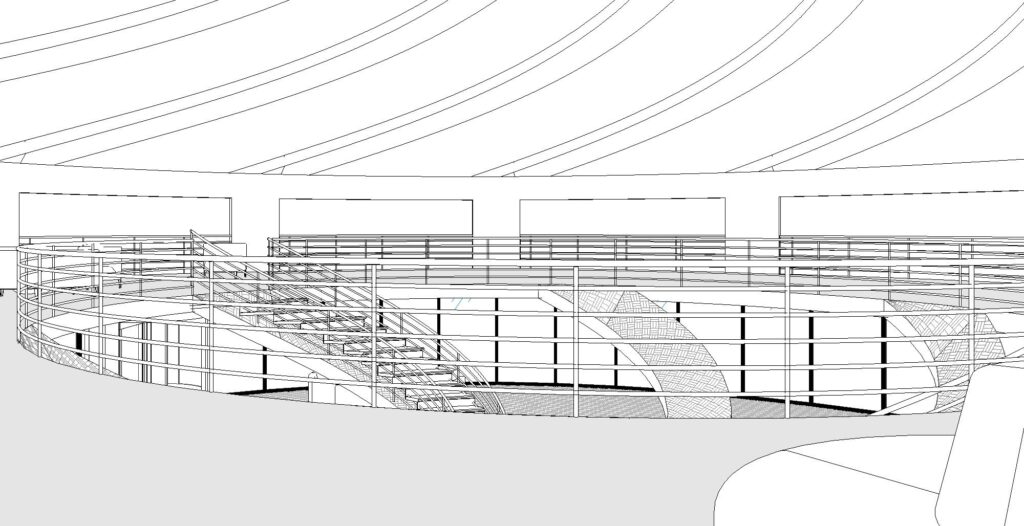
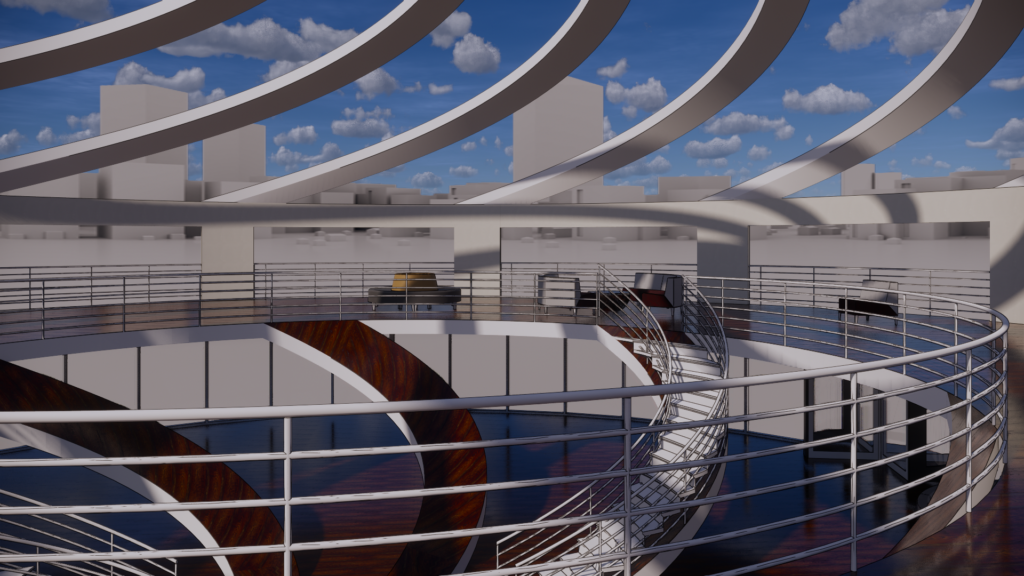
To demonstrate this technique, I recently used it to create curved slopes in a building project. The versatility of this approach allowed me to achieve the desired effect seamlessly.
So, what can you create with this newfound knowledge? I encourage you to experiment and explore the possibilities within your projects.
Conclusion: Enhancing Architectural Creativity
In the world of architectural design, versatility is key. Knowing how to achieve effects like raked floors, even in software primarily designed for architectural modeling, can give your projects a unique edge. Whether you’re designing for the stage or screen, Revit’s flexibility can empower your creative vision.
Ready to try it out? If you’d like more detailed instructions on using this technique, you can find them [here](insert Autodesk instructions link).
Let your architectural imagination run wild and see how this technique can add depth and perspective to your designs, just like the magic of theater.
Transforming Concept Art into Stunning Set Designs: A Journey of Creativity
In the realm of set design, inspiration can strike from unexpected sources, and for me, concept artists are a boundless wellspring of creative energy. These skilled individuals possess the unique ability to infuse my set designs with distinct flavors that resonate deeply with audiences. In this article, we’ll explore how concept artists collaborate with production designers to lay the foundation for immersive cinematic worlds and how set designers like myself take those broad strokes and breathe life into them for the camera.
Original: Streets Walking by Jordan-Grimmer
One remarkable concept artist who has left an indelible mark on the industry is Jordon Grimmer, whose portfolio can be admired at https://jordangrimmer.artstation.com. Hailing from London, United Kingdom, Jordon Grimmer has made waves as a freelance concept artist in the video game industry. His visionary artwork caught my attention a few years ago, sparking an intriguing challenge: could I translate the essence of his paintings into tangible sets using only Autodesk Revit?
Revit 3D View
My mission was clear: dissect Jordon’s compositions into as many Revit system and project families as possible, meticulously recreating the intricate details that define his captivating worlds. To ensure the authenticity of my creations, I harnessed the power of Enscape for swift rendering, allowing me to gauge the harmony of my scenes against the originals. This practice not only enriches my skill set but also encourages me to experiment with novel construction techniques, ultimately refining my overall design process.
Autodesk Revit Plan View Rendered in Enscape
The results of these scenic drills are nothing short of mesmerizing, and I am excited to share my ongoing journey of experimentation with you. As I continue to push the boundaries of set design and explore innovative ways to bring conceptual art to life, I invite you to join me on this artistic expedition. Together, we’ll witness the transformation of imagination into reality, where each set becomes a captivating narrative waiting to be unveiled on the silver screen. Stay tuned for more awe-inspiring creations and insights into the world of set design.
My First Directorial Debut: A Student’s Journey into Filmmaking
Stepping into the director’s chair for the first time is akin to embarking on an exhilarating rollercoaster ride. As a graduate student pursuing my master’s in fine art at the Savannah College of Art and Design, this experience was a pivotal moment in my filmmaking journey.
https://vimeo.com/34744191
The project revolved around a quirky exotic dancer psyching herself for a peculiar and enigmatic night’s work. This narrative, filled with intrigue and character complexity, excited my creative spirit. Collaborating closely with my talented cinematographer, Catalina Alcaraz-Guzman, we embarked on translating our vision onto the screen.
One of the most challenging aspects was getting the lighting right inside the car: the confined space and the need to create a specific mood added complexity to the task. Every shadow, every beam of light, was a brushstroke on our cinematic canvas. It was in these moments of trial and error that I discovered the true artistry of filmmaking, where precision meets creativity.
Reflecting on this experience, I pondered what I might do differently if I had the opportunity to revisit that director’s chair. I realized I would embrace a faster pacing, injecting a sense of urgency into the narrative. The world would be a bit “grimier,” capturing the raw and unfiltered essence of the story.
This first directorial debut was a whirlwind of discovery and growth. It taught me that the director’s chair is not just a seat; it’s a realm of endless possibilities where storytelling and artistry converge. It’s a journey I eagerly continue as I navigate the exciting world of filmmaking and uncover new layers of creativity with each project.
Digital White Models in Film: Bridging Creative Vision and Practical Execution
The art department’s role in filmmaking often remains behind the scenes, quietly shaping the visual narrative. While the director, cinematographer, and production designer get the limelight, set designers and art directors play a crucial role in bringing a script to life.
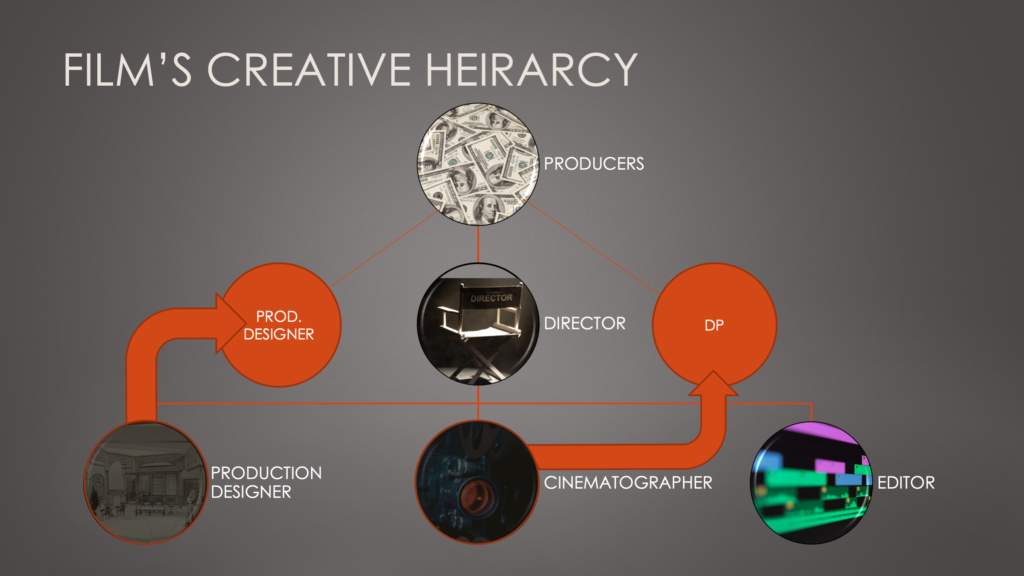
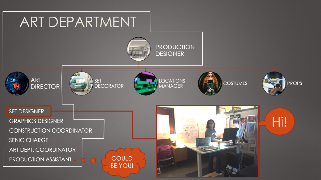
In a typical film production hierarchy, the director sets the vision, casts the actors, and hires department heads. The director of photography (DP) takes charge of the camera and lighting, while the production designer (PD) oversees the art department. The PD is not just an artist; they’re the logistical head, steering the ship of creative departments like costume design, location management, prop management, and set decoration.
Within the art department, the production designer’s right-hand person is the art director, who is responsible for managing set and graphic designers, as well as the scenic and construction departments. Their collaboration ensures the sets are not just visually stunning but also functionally sound for filming.
Set designers, in turn, bridge the gap between the production designer’s vision and the practical needs of construction and scenic departments. They create drawings and models that guide the construction and painting of sets. This process has evolved significantly with the advent of technology. The software allows set designers to develop 3D models alongside technical drawings in real time, streamlining the collaborative effort.
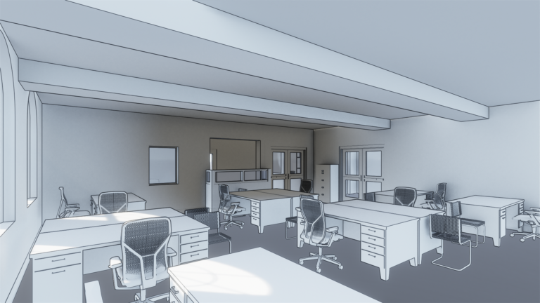
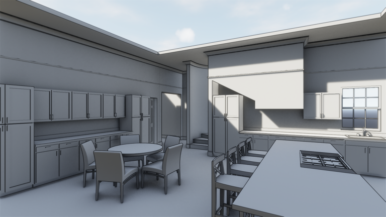
One technique embraced by set designers is the use of digital white models. These models are inspired by traditional foam-core architecture models, which are still used for complex or stunt-heavy environments. Digital white models serve a specific purpose – they focus on form over color or texture. During pre-production, this clarity helps integrate input from various team members without constraining their creativity.
In the world of filmmaking, where every detail matters, digital white models offer an efficient way to communicate the spatial design without getting bogged down in intricate details. They serve as a canvas upon which the collaborative team can paint the nuances of storytelling.
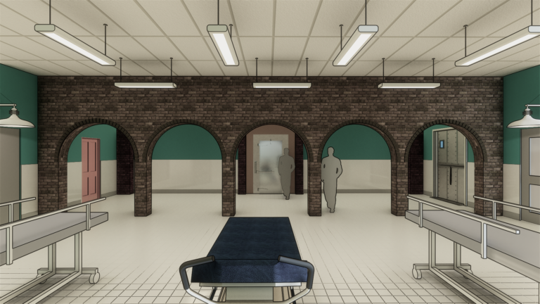
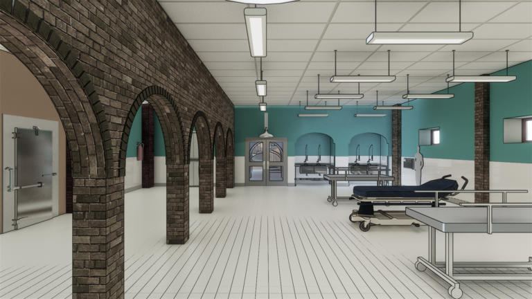
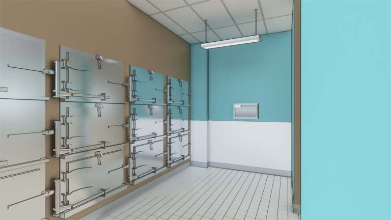
For example, I’d like to share insights from a canceled pilot titled “Superstitions.” In this project, I utilized digital white models for studying sets such as a funeral home and morgue. These models provided a foundation for discussions with various stakeholders, facilitating a shared understanding of the space’s layout and potential. They allowed us to explore the form, consider practical functions, and leave room for creative interpretation.
While the art department’s work often remains unseen in the final film, it’s a testament to the collaborative nature of filmmaking. The hierarchy, from directors to set designers, is a complex structure where each role is integral in turning a script into a cinematic masterpiece.
In the end, the magic of filmmaking lies in the harmonious fusion of creative vision, practical execution, and the relentless pursuit of storytelling excellence.
Exploring the Synergy Between Set Design and Real Space Layout
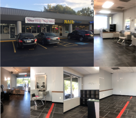
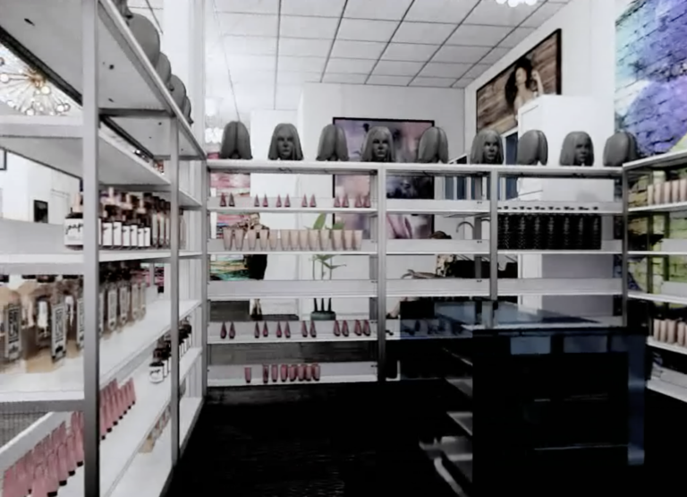
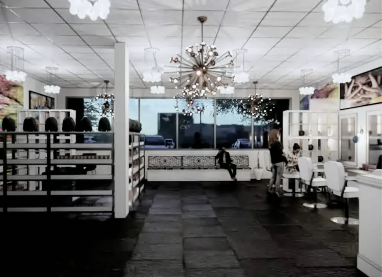
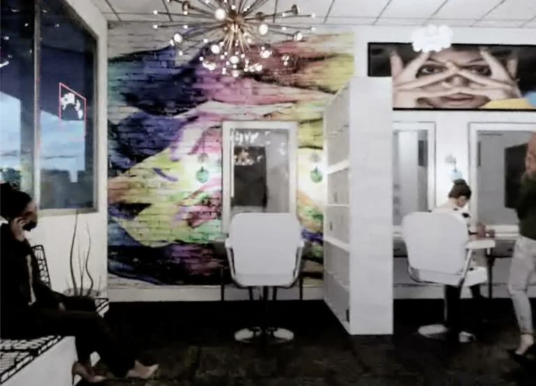
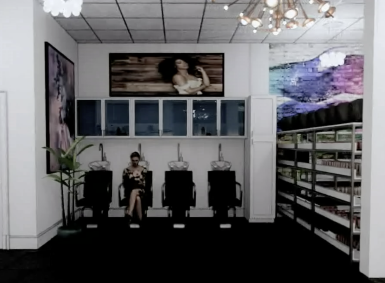
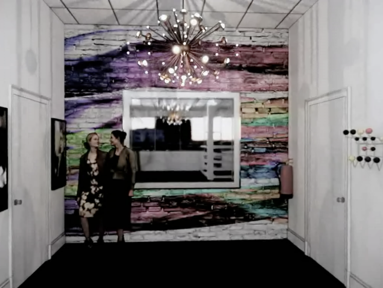
Recently, I immersed myself in a project quite different from my usual endeavors as a set designer. A friend approached me with a request to design a concept for her beauty salon. Armed with little more than blurry photographs of the space, I embarked on a journey that would unexpectedly reaffirm the interconnectedness of my two worlds: set design and accurate space layout.
With a limited timeframe of around 8 hours, I turned to my trusted tools, Revit and Enscape, to breathe life into my vision. The result was a 3D walkthrough that offered a tantalizing glimpse into the potential transformation of the salon’s interior.
While this project had unique constraints and considerations, it was striking how the fundamental principles I apply in set design seamlessly translated to the task. What had started as a favor soon became a reminder of the profound parallels between designing for a narrative-driven set and a functional real-world space?
Set design is an intricate dance of storytelling through spatial arrangement, and it was enlightening to recognize how these same principles apply to the layout of a salon. In both cases, the design should guide people through an experience, whether a film’s narrative or a salon visit’s journey.
https://vimeo.com/377178716
Considerations like flow, accessibility, and the arrangement of key elements play an essential role, just as they do when crafting immersive sets. The real-world functionality of the salon mirrors the practicality that underlies many of my set designs. The salon’s layout must cater to the needs of its clients, just as a film set must facilitate the seamless execution of scenes.
This endeavor was a reminder that, at their core, set design and real space layout share the same foundation – the understanding of how humans interact with and move through spaces. In both worlds, it’s about creating environments that evoke emotions, enhance experiences, and tell a compelling story.
This experience affirmed that the skills and insights gained in one realm can be seamlessly applied to the other. Whether it’s crafting the perfect scene for a film or optimizing a salon’s layout for clients, the art of spatial storytelling remains at the heart of both endeavors. My journey with this beauty salon project served as a delightful convergence of my two passions and a testament to the power of multidisciplinary creativity.
Cimarron Chronicles: A Land Rush Through the Eyes of Art Direction
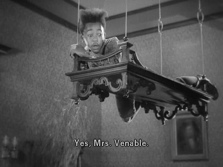
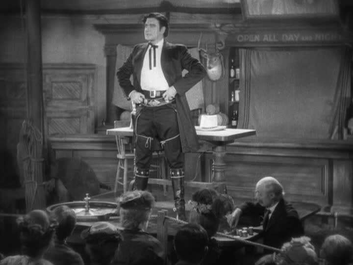
Before delving into the brass tacks of “Cimarron,” it’s essential to express a few personal reflections. The rapid shift from silent films to synchronized talkies in just over a year is nothing short of awe-inspiring. It’s a testament to human ingenuity. Secondly, despite the film’s troubling portrayals of marginalized groups, it surprisingly emerges as a captivating piece of cinema history, with moments that left me laughing out loud. Lastly, I can’t help but believe that Yancey Cravat served as the blueprint for Elvis Presley’s persona, from the wavy locks to the cocky demeanor.
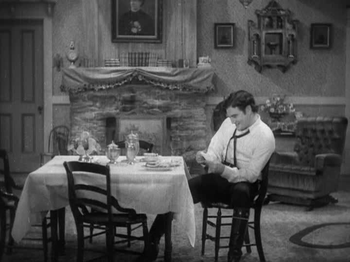
Now, to the artistic assessment. Max Rée’s creation of the 1889 Indian Oklahoma Lands is a world I would have enjoyed living in if it weren’t for the glaring prejudices and injustices depicted. The film brims with energy, much credit to cinematographer Edward Cronjager. The scenic design, a colossal undertaking for its time, merits top marks for believability. The land rush scenes whisk viewers into the excitement of claiming territory that wasn’t rightfully theirs. Director Wesley Ruggles wisely uses static aerial views to mark the passing years in Osage’s main market street.
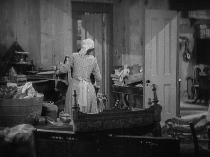
What stands out most is the attention to detail. Hand-painted signs, battered barrels, and canvas tents fill the scenes, creating a vibrant and layered world. The transformation of the Carvats’ family home mirrors the town’s evolution, capturing the spirit of carving success in an uncharted landscape. The film’s rich, nuanced visuals, even in silence, convey its essential themes.
The Douglas DC2, prominently featured in the film, is a stunning example of the early days of commercial aviation. This sleek classic transport, rented from American Airlines, provided an exquisite backdrop against the rugged mountain landscapes. The plane’s interior, meticulously recreated on a soundstage, exudes luxury, riveted leather, and warm wood paneling, making it a highlight of the film’s set design. Even the intricacies of the cash register at Grat Gotch’s Hall of Chance add a layer of authenticity and delight to the scenes.
While “Cimarron” may have its shortcomings, particularly in its portrayal of marginalized groups, it excels in its scenic design. The film transports viewers to a bygone era, capturing the energy and excitement of a land rush, and providing a meticulously detailed world. For these reasons, “Cimarron” certainly earns its place as a captivating piece of cinema history, despite the blemishes. In our exploration of its scenic elements, it secures a solid seven out of ten scenic fitches.
Introducing the Scenic Fitch Rating: A New Perspective on Film Reviews
Today, I had an exciting revelation that’s set to remake the way I approach film reviews. I’ve devised a unique rating system, the “Scenic Fitch Rating,” to evaluate movies based on their achievements in visual storytelling. This innovative approach promises to add a fresh layer of insight to my critiques and enhance the cinematic experience for both myself and my readers.
The Scenic Fitch Rating system operates on a scale from one to ten, with each film receiving a specific number of “scenic fitches.” But what exactly is a scenic fitch? Also known as “lining brushes,” these brushes are typically 1/4″ to 2″ in width and are primarily used to add highlights and shadows to a painting. They feature a long handle that tapers just right for attaching to a bamboo pole. For scenic artists and painters, mastering the art of using fitches on a pole can save both time and future backaches.
What sets scenic fitches apart is their ability to create smoother and longer lines in a stroke, thanks to their longer bristles. This design allows them to hold more paint and distribute it evenly, making them an invaluable tool in the scenic artist’s kit. They are a fundamental building block for bringing those breathtaking cinematic moments to life on the screen.
Now, the Scenic Fitch Rating will become a central part of my film reviews. A film’s rating will range from a minimum of three scenic fitches, indicating a consistent setting for the characters, to a perfect ten, celebrating designers who have displayed innovative techniques and a deep understanding of scenic practices. A rating of five will signify that the movie’s environments effectively express traits relevant to the character arcs.
With this new rating system in place, I’m excited to dive into the world of film with a fresh perspective. It’s a journey that promises to make every movie-watching experience even more engaging and enlightening. So, let’s embark on this cinematic adventure together and see how films fare on the Scenic Fitch Rating scale.