The Colorful Grandeur of ‘The Adventures of Robin Hood’
In my twenties, I was utterly baffled by the critical praise for “Glorious Technicolor.” My only experience with the process was watching Nick-at-Nite trailers, which could never substitute for a theatrical screening. Honestly, I don’t even remember watching The Adventures of Robin Hood all the way through. So, I’m not afraid to admit that I was jumping around with glee while reviewing this film…seriously, I did not sit down. The saturation level in Adventures of Robin Hood was astonishing. Colors simply burst out of the screen and contemporary films like Run Lola Run, Limitless, or anything from Tim Burton or Terry Gilliam. From the parchment paper opening credits with their specially designed Warner Brothers shield, I was sold hook, line, and sinker…oops the wrong story.
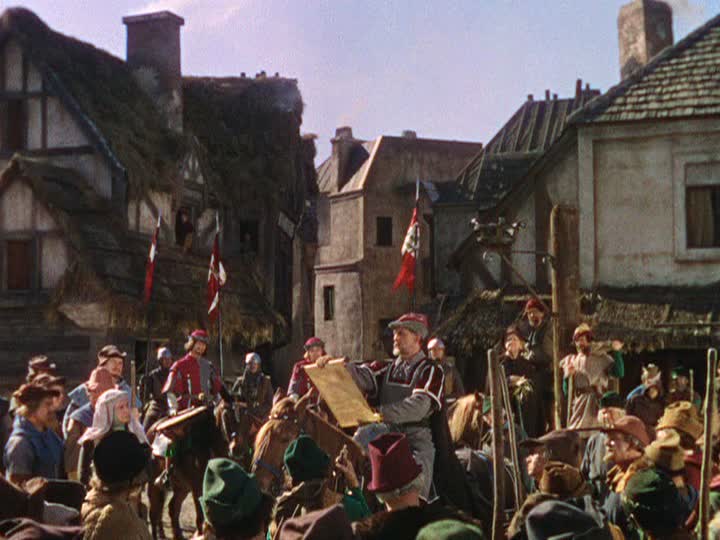
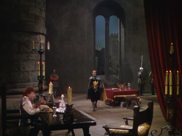
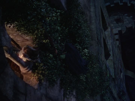
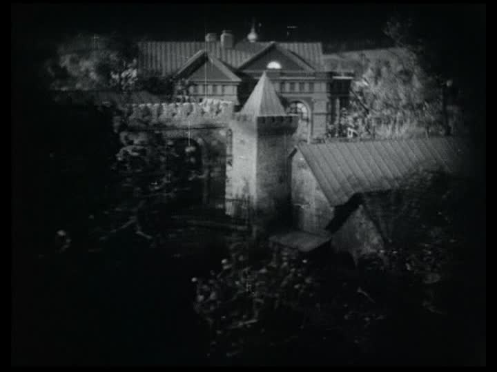
Let’s start in the town square where the royal messenger read news of King Richard’s capture by Leopold of Austria. Half-timbered style buildings, with their plaster, infilled exposed beams, framed the crowd and placed audiences on a sympathetic level with the townsfolk. The communal setting starkly contrasted with Nottingham castle’s barren stone walls, where Prince John forms his anti-Saxon plot. Compositionally, this started a trend where frames outside the castle were claustrophobically filled with people and activity but dialog inside showed extreme depth (instead of having actors shelled against walls). The scenic masonry walls were painted to perfection and punches of royal-red fabric made the eye jump from one side of the screen to the other. And just in case you missed it, when Prince John spills his wine, the dripping, crimson liquid is a not-so-subtle hint of the carnage to come.
There were a few scenic missteps, like the rock formation from which Robin orated to his Saxon townspeople. It was a prop because the surface showed little sign of weathering or mossy overgrowth. However, many other elements carried the film to soaring heights. The matte paint drops (ex. exterior castle top or below Marion’s window) were the most expressionistic I’ve seen. I was captivated by the banquet hall’s working fire-pit, iron rivet doors, and all the rusted candelabras. Longbows, swords, and quarterstaffs (the name refers to hand position on the pole) were used with precision during the numerous friendly and not-so-friendly fight scenes. Also, I could think of several alternate decorative uses for Robin’s handsome, leather, arrow bag.
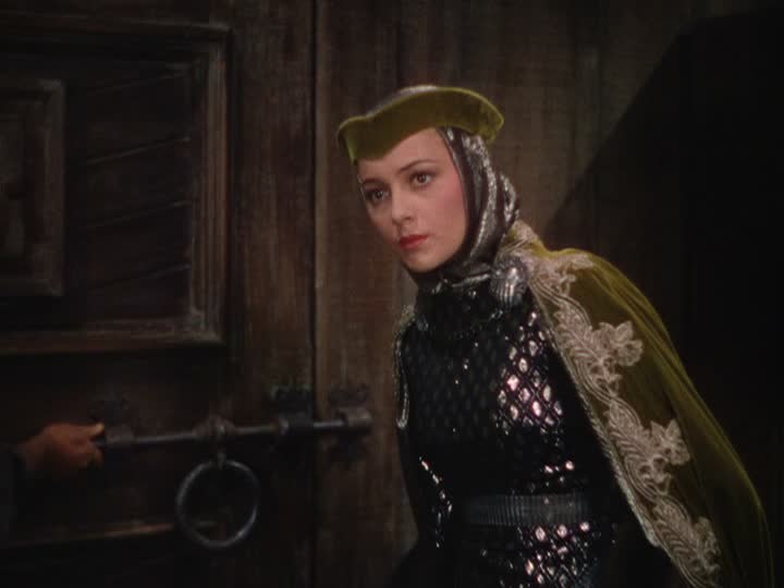
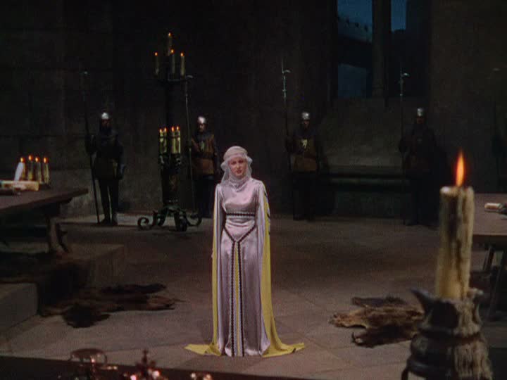
The Adventures of Robin Hood was switched from black and white to Technicolor at the last minute, so the wardrobe was designed with punchy contrast. The costumes in the film are inventive, tactile, and vibrant. They also gave me further insight into how art department designers achieved their tonal variety historically. Maid Marian’s constantly changing wardrobe remained a fictional, shimmering delight. Although choosing favorites would be impossible, costume high points for me were her archery contest glider, the garb worn in the Merry Men’s tavern, and her silver/yellow satin gown during her trial. The men were equally as graceful. Sir Guy of Gisbourne’s suede, emerald, poca-dot tunic worn while sending a henchman to kill King Richard was commanding.
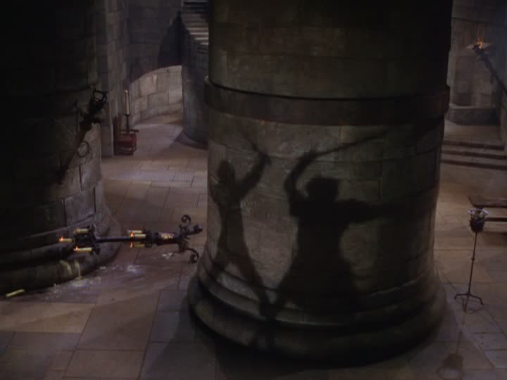
Lighting was unmotivated throughout the film but I didn’t care because the depth was so rich. Many scenes were filmed day for night, but cuts sporadically missed their blue lighting cues (especially studio process shots). One lovely forest scene, as Robin Hood escaped Prince John’s celebratory dinner, had stark moonlight streaks raining through dense oak tree branches. Director Michael Curtiz, also seemed to favor action playing out in silhouettes on the massive, block walls. Some famous examples shaded Prince John’s order to forfeit Locksley Estates and grazed the last battle between Robin and Sir Guy.
Despite switching directors mid-way through (Keighley-outdoor scenes, Curtiz studio shooting), Adventures of Robin Hood was a narratively vibrant piece of cinema. The film captured the pageantry of the period and added new zest and wonder. The Adventures of Robin Hood managed to stay faithful architecturally but pushed boundaries with their costumes’ textures and colors. It whole-heartedly deserved seven out of ten scenic fitches.
Cimarron Chronicles: A Land Rush Through the Eyes of Art Direction
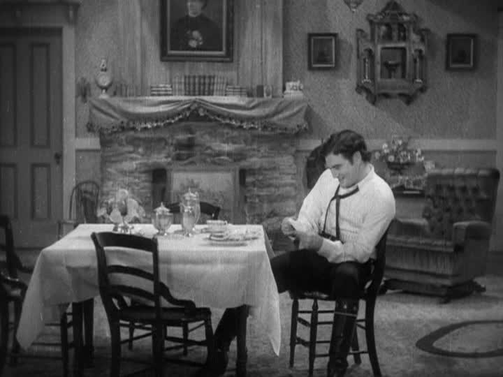
Before delving into the brass tacks of “Cimarron,” it’s essential to express a few personal reflections. The rapid shift from silent films to synchronized talkies in just over a year is nothing short of awe-inspiring. It’s a testament to human ingenuity. Secondly, despite the film’s troubling portrayals of marginalized groups, it surprisingly emerges as a captivating piece of cinema history, with moments that left me laughing out loud. Lastly, I can’t help but believe that Yancey Cravat served as the blueprint for Elvis Presley’s persona, from the wavy locks to the cocky demeanor.
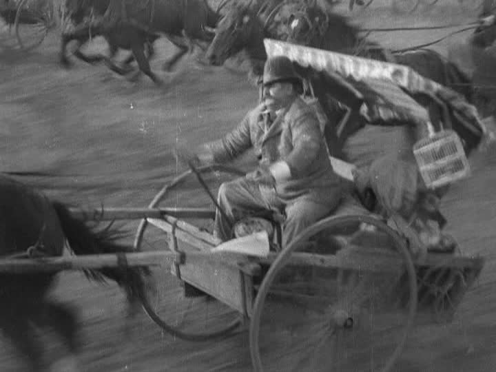
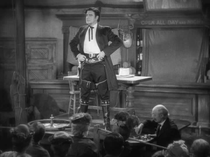
Now, to the artistic assessment. Max Rée’s creation of the 1889 Indian Oklahoma Lands is a world I would have enjoyed living in if it weren’t for the glaring prejudices and injustices depicted. The film brims with energy, much credit to cinematographer Edward Cronjager. The scenic design, a colossal undertaking for its time, merits top marks for believability. The land rush scenes whisk viewers into the excitement of claiming territory that wasn’t rightfully theirs. Director Wesley Ruggles wisely uses static aerial views to mark the passing years in Osage’s main market street.
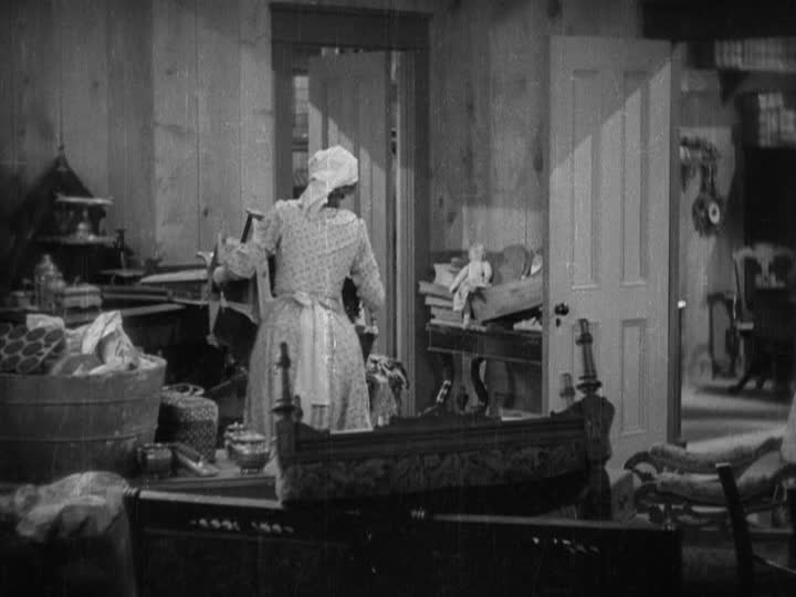
What stands out most is the attention to detail. Hand-painted signs, battered barrels, and canvas tents fill the scenes, creating a vibrant and layered world. The transformation of the Carvats’ family home mirrors the town’s evolution, capturing the spirit of carving success in an uncharted landscape. The film’s rich, nuanced visuals, even in silence, convey its essential themes.
The Douglas DC2, prominently featured in the film, is a stunning example of the early days of commercial aviation. This sleek classic transport, rented from American Airlines, provided an exquisite backdrop against the rugged mountain landscapes. The plane’s interior, meticulously recreated on a soundstage, exudes luxury, riveted leather, and warm wood paneling, making it a highlight of the film’s set design. Even the intricacies of the cash register at Grat Gotch’s Hall of Chance add a layer of authenticity and delight to the scenes.
While “Cimarron” may have its shortcomings, particularly in its portrayal of marginalized groups, it excels in its scenic design. The film transports viewers to a bygone era, capturing the energy and excitement of a land rush, and providing a meticulously detailed world. For these reasons, “Cimarron” certainly earns its place as a captivating piece of cinema history, despite the blemishes. In our exploration of its scenic elements, it secures a solid seven out of ten scenic fitches.
Lost Horizon (1937): A Scenic Odyssey Through Shangri-la
In Frank Capra’s “Lost Horizon” (1937), a journey from the bustling streets of Baskul, China, to the mythical haven of Shangri-la unfolds. While the film carries a mix of delights and disappointments, the scenic design leaves an indelible mark on the viewer.
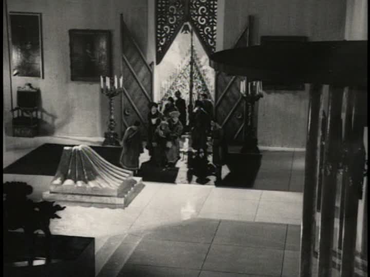
Capra and cinematographer Joseph Walker deserve commendation for their visual storytelling prowess. The clarity, lighting, and frame compositions, especially in Shangri-la, offer a visual treat. Multi-camera setups enhance the capture of actor reactions and dramatic sequences, elevating the cinematic experience.
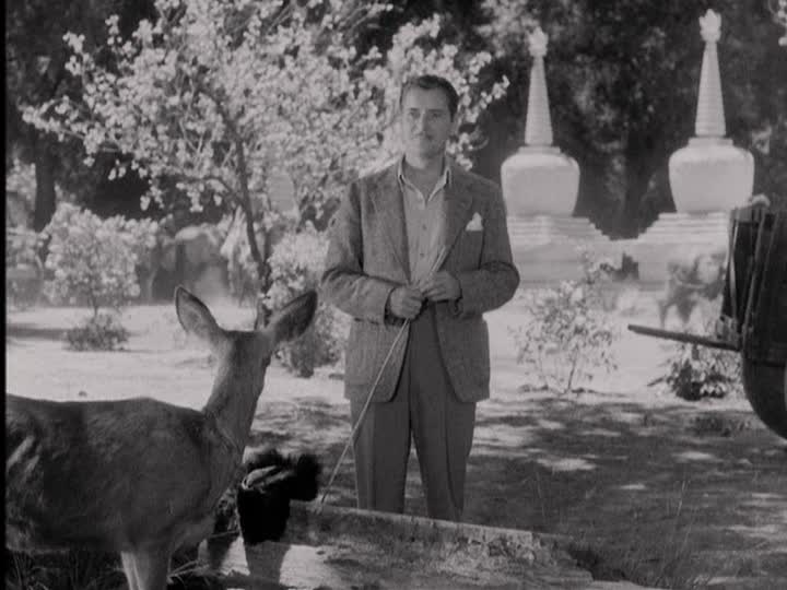
The film’s portrayal of the Douglas DC2, the aircraft for Robert Conway’s expedition, is a visual standout. The plane, rented from American Airlines, is given ample screen time and shines against the mountainous backdrop. Its interior, created on a soundstage, exudes luxury with riveted leather, wood paneling, and glass-ball lamps. The cabin’s spacious feel and dynamic camera work make it a memorable part of the film.
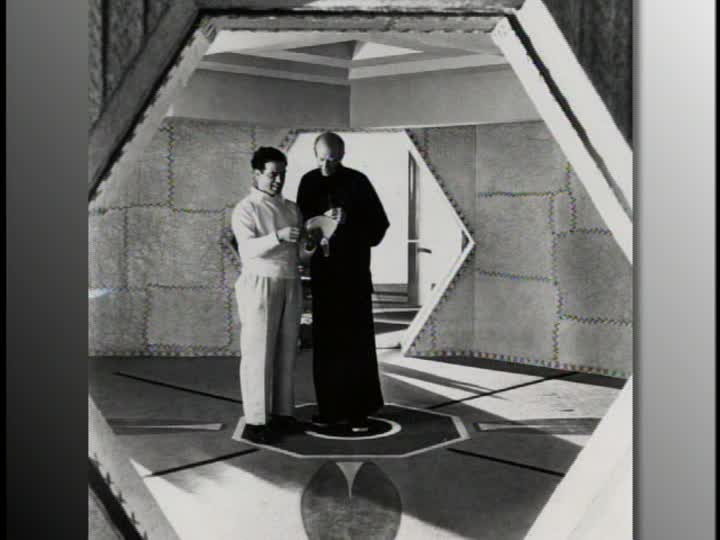
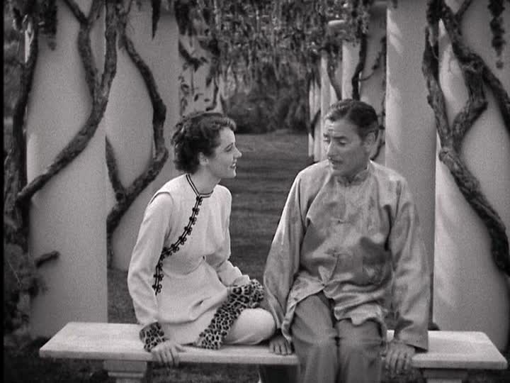
However, as the narrative transitions to the Himalayan utopia, the scenic elements take an unexpected turn. The lamasery lacks the traditional architectural motifs of Tibetan temples, leaving a void in authenticity. While Goosson’s attempt to blend architectural styles and incorporate Asian elements is intriguing, it sometimes feels disjointed.
The film introduces a dream-like aura, but the disparate designs occasionally detract from the overall experience. Star Trek-like doors, tufted interior walls, and leopard-fur wrist cuffs challenge the film’s cohesion.
In spite of these aesthetic challenges, “Lost Horizon” remains a massive production undertaking that largely succeeds. The scenic design, though not without flaws, contributes to the film’s unique atmosphere. In the end, “Lost Horizon” earns a rating of five out of ten scenic fitches, a testament to its ambitious scenic endeavors.
“The Tempest” (1928): A Scenic Odyssey in Imperial Russia
Directed by Sam Taylor and featuring art direction by William Cameron Menzies, “The Tempest” (1928) offers a visual journey through the stark yet enchanting setting of Imperial Russia in 1914. The film’s art direction crafts a captivating backdrop for the characters’ evolving journeys.
The opening scenes gracefully sweep over regal residential buildings and stone monasteries, setting the stage for what’s to come. The attention to detail becomes evident as the camera pans over the wooden cladding of a dilapidated peasant barracks, seamlessly transitioning from one setting to another. This meticulous assembly of the middle and background draws viewers into the story.
Amidst this richly layered backdrop, we follow Ivan Markov, portrayed as a dedicated man more concerned with his task than his comfort. The wood-paneled interior of his study exudes simplicity and functionality, reflecting his character’s principled nature. The room’s realism subtly contrasts with elements like painted wall flats and scattered leather-bound books, adding depth to the character’s portrayal.
In contrast, the grandeur of the General’s quarters is a testament to aristocratic opulence. Lofty arches, gilded thrones, and towering ceilings underscore the stark contrast in social status. The examination room, where we meet the heroine, features platform tables that inspire respect for those seated upon them. The scenic design effectively underscores the contrast between Ivan’s humble origins and the ostentatious world of the aristocrats.
Princess Tamara’s room provides another visual treat with its lush, tactile qualities, from the silky canopy to geometrically tiled floors. It reflects her pampered life, contrasting sharply with the invasion of feelings brought on by her interactions with Ivan.
The scenic design beautifully supports the story’s emotional arcs and establishes a visually complex world. While competent in its portrayal of 1914 Russia, “The Tempest” might not dazzle with groundbreaking design elements. However, it successfully weaves the characters’ stories into the rich tapestry of their surroundings.
In the end, “The Tempest” receives a respectable rating of four out of ten scenic fitches, a testament to the film’s dedication to setting the stage for the characters’ transformative journeys.
Introducing the Scenic Fitch Rating: A New Perspective on Film Reviews
Today, I had an exciting revelation that’s set to remake the way I approach film reviews. I’ve devised a unique rating system, the “Scenic Fitch Rating,” to evaluate movies based on their achievements in visual storytelling. This innovative approach promises to add a fresh layer of insight to my critiques and enhance the cinematic experience for both myself and my readers.
The Scenic Fitch Rating system operates on a scale from one to ten, with each film receiving a specific number of “scenic fitches.” But what exactly is a scenic fitch? Also known as “lining brushes,” these brushes are typically 1/4″ to 2″ in width and are primarily used to add highlights and shadows to a painting. They feature a long handle that tapers just right for attaching to a bamboo pole. For scenic artists and painters, mastering the art of using fitches on a pole can save both time and future backaches.
What sets scenic fitches apart is their ability to create smoother and longer lines in a stroke, thanks to their longer bristles. This design allows them to hold more paint and distribute it evenly, making them an invaluable tool in the scenic artist’s kit. They are a fundamental building block for bringing those breathtaking cinematic moments to life on the screen.
Now, the Scenic Fitch Rating will become a central part of my film reviews. A film’s rating will range from a minimum of three scenic fitches, indicating a consistent setting for the characters, to a perfect ten, celebrating designers who have displayed innovative techniques and a deep understanding of scenic practices. A rating of five will signify that the movie’s environments effectively express traits relevant to the character arcs.
With this new rating system in place, I’m excited to dive into the world of film with a fresh perspective. It’s a journey that promises to make every movie-watching experience even more engaging and enlightening. So, let’s embark on this cinematic adventure together and see how films fare on the Scenic Fitch Rating scale.
The Most Beautiful Fraud in the World
I wrote a short (for academics) position paper on the French New Wave and Production Design for an online publication called The Cine-Files. It was actually fun to get a little (maybe a lot) nerdy about the history of the production design craft. I would love to have your feedback.
Originally Posted May 28, 2012
“The Most Beautiful Fraud in the World”: A Production Designer Reflects on the War between French New Wave and Scenic Design
by Yolande Thame
For me, the height of film production arts lies within the built environment, which is imagined, sketched, drafted, modeled, and finally constructed. Whether on a sound stage or developed sitting on an exterior landscape, the physically built facade holds elevated esteem because it clearly signals a conscious decision to lead (or manipulate) a viewer’s perspective. Film sets constitute a particularly tangible, if temporary, indication of narrative context because they reveal a production designer’s ability to conceive a world from scratch. However, there is a qualitative distinction between “narrative design,” which visually defines the socioeconomic status of characters, frames the realistically- or fantastically-based time period/location, and sets the aesthetic mood, and “set dressing,” those efforts to “assemble” physical objects, worldly possessions, and contextual details that support story-telling objectives. The narrative design takes a holistic approach to the visual aesthetics of a film and frequently uses set dressing to convey additional background for a screenplay, but effective set dressing seldom occurs without a cohesive narrative design. On its own, set dressing is reduced to a random assemblage of elements, which can leave viewers with vital gaps in character identity or distract the audience with their misplacement. Those types of spectator distractions shift attention away from the story and alert viewers to the artifice of the film medium, which is why most production designers prize cinematic work that remains “unconsciously registered background” or “invisible” to the viewing audience.[1]
The French New Wave overtly challenged narrative design’s aspiration towards imperceptibility or plausible “realism.” These young and ambitious directors often chose to omit or radically reconceive the traditional art of production design. My intent is to explore the narrative impact of those decisions and to map how the New Wave influenced the production design profession in general.
Historic Landscape
The French cinematic tradition that preceded the Nouvelle Vague was well-versed in how constructed sets interacted with the camera lens, lighting, and other elements of mise-en-scène to produce spatial acceptance by film audiences. Using scaled models, painted drops, and other depth and perspective tricks, production designers, as early as the 1910s, were already capable of creating seemingly holistic environments that visually disintegrated if shifted from their intended vantage points.[2] By the 1930s-40s, both European and Hollywood entertainment industries competitively utilized traditional production design methods and the modeled environment represented the status quo. Scenic design techniques, which partially originated from live theatrical performances, spread through Europe by way of the craftsman immigrant populations. These highly skilled architects and artists, displaced from countries like Russia and Germany after the Bolshevik and First World Wars, found acceptance within the progressive entertainment industry despite being shunned by other areas of society. Within the visual realm, these immigrant interpretations of “French” scenic space were a necessary exaggeration of contemporary artistic trends and historical architectural motifs that ultimately aided nationalistic agendas to promote local work over the influx of Hollywood films.[3] The stylistic patriotism was essentially successful because, despite both world wars constricting the production and flow of movies in France to nostalgic or propaganda varieties, even American film studios looked across the Atlantic for visual decorative inspiration. As Tim Bergfelder, Sue Harris, and Sarah Street assessed in their book, Film Architecture and The Transitional Imagination: Set Design in 1930s European Cinema, these “émigré” scenic artists “deployed design strategies that privileged the exotic, the distant, and the historical” and resulted in an aesthetic they termed “poetic realism,” which often created city landscapes and glossy interiors unrecognizable but mesmerizingly engaging to the average French citizen.[4] Soon after, the hyper-stylized visual trends of the 1930s were morphed and repackaged into a “tradition of quality.” This label was cheekily assigned to films produced under government aid programs, developed to bolster the war-crippled industry, which fostered the use of “approved” craft traditions despite their appropriateness for the story.[5]
Although the “tradition of quality” signaled more about the film production infrastructure than a specific scenic aesthetic, it does, however, highlight a preferred artistic mode for movie fabrication. It represented a departure from the “poetic realism” of the 1930s to what Francois Truffaut labeled “psychological realism.”[6] Film scholar John Hess later explained Truffaut’s phrase in this way:
While the films of ‘poetic realism’ were content to assign control to destiny or human weakness as in Le Quai des brumes [Port of Shadows] or Le Jour se lève [Daybreak] (1939), the films of ‘psychological realism’ tended more often to reproach society for human evil and suffering: Autant-Lara’s Douce [Love Story] (1943) and Le Diable au corps [The Devil in the Flesh] (1947), and Clement’s Jeux interdits [Forbidden Games] (1952)…[7]
Hess essentially highlighted a perspective shift from “decor and situation” to a fascination with “character.”[8] While screenplays were changing to adopt this new interest, the scenic environment remained aesthetically static to the decorative nostalgia of bygone eras. Although economics (specifically the reuse/repurposing of construction elements) can take some credit for repetitive scenic appearances across many early 1950s films, there was a general discord between story and setting execution. The Nouvelle Vague, however, represented an attempt to supplant the importance of these formulaic narrative conventions that used studio sets to promote an overly polished environment that audiences misguidedly grew to accept as distinctly “French.”
The French New Wave began as a rebellion against the hierarchical studio system, which produced lofty visions that contradicted the realities of contemporary European life. By the 1950s, the studio system contained countless foreign aesthetic filters that rendered the final cinematic products ultimately disconnected from viewing audiences. Immigrant craftsmen moved up the movie production ranks and gained significant artistic influence over film production, which resulted in romanticized visions of French culture. After World War II, many film projects erred on the side of safety by adapting classic novels or historical themes but through lenses aimed at emphasizing “accepted” character behavior rather than strictly adhering to the literary confines of the original works.[9] Even those who dared to broach the subject painted France’s role in the war in a politically patriotic manner.[10] A general social yearning for honest and relevant movies, not just about the war but also reflecting contemporary culture, grew over time. Directors like Claude Chabrol, Jacques Demy, Jean-Luc Godard, Louis Malle, Jacques Rivette, Eric Rohmer, and Francois Truffaut were all concerned with more accurately depicting the rambling, rebellious, and arbitrary lives of youthful, post-war characters. The Vague offered a new documentary style of filmmaking using mobile cameras, outdoor shooting, found locations, natural lighting, long meandering takes, brisk editing, novel jump cuts, and improvised storylines. Furthermore, the New Wave emphasized filmmaking as personal expression (auteur cinema), vastly reducing the film crew to key personnel over which directors had tight control. All of these factors relegate the production designer, if hired at all, to a continuity wrangler (editor) rather than a visual gatekeeper (creator).
The Core Cases
À Bout De Souffle (1959)
Jean-Luc Godard’s À Bout De Souffle (Breathless, 1959) tells a sexually charged story plucked from a 1952 French news headline and follows the lead protagonist, a mischievous young criminal, from Marseilles to Paris, with a false naturalistic style. Godard broke the fourth wall, cut between scenic actions, favored the hand-held camera, used editing to establish erratic pacing, and employed only one art production member, Clément Hurel, who designed the movie posters. For this breakout New Wave film, Jean-Luc Godard planned shoots on a daily basis, many times revealing the scene contents to actors minutes before the camera rolled.[11] Under such conditions, the production’s art department would only have time to assemble key items handled by actors, typically called hero props (stylistically cued from Godard’s personal affinities), and/or randomly react to changing story-lines with whatever was on hand or could be quickly constructed. So visual composition was left, almost exclusively, to the director and his extended eyes, the cinematographer. Visually, the film captures the romantic Parisian streets and presents fresh and stylishly dressed characters that epitomize youthful exuberance. Godard’s use of real spaces creates a dichotomy where audiences glimpse “authentic” French environments but the characters (and story) have no narrative ownership over those locations. The famous eleven-minute bedroom scene takes place in a hotel-like space of bare walls sprinkled with thumbtacked poster replications of noted French paintings (Figure 1). In such a sterile environment, it is difficult to determine the heroine’s (Patricia Franchini) mood, temperament, or character backstory. À Bout De Souffle was a directorial pioneer but used existing places (motivated by availability, not character development) as the cornerstone of its aesthetic language and, therefore, cannot really be considered scenically progressive. However, the freedom with which locations were utilized opened the doors for younger directors to experiment with story-telling methods.
Figure 1: À Bout de Souffle (Breathless). 1959. Couple contemplates which blank wall to place a recently purchased Renoir print.
Tirez sur le Pianist (1960)
Francois Truffaut’s second feature, Tirez sur le pianist (Shoot the Piano Player, 1960), also showed a fresh perspective on novel adaptation practices. Truffaut loosely based the film on David Goodis’s Down There but modified the lead protagonist to be a timid, awkward, and scared gentleman rather than the decisive caricature in the novel. We follow an insecure, ex-piano prodigy, Charlie Kohler, as he attempts to escape his demeaning professional life, save his hapless brothers from pipe-smoking gangsters, and regain his faith in romance. The new direction resulted in disjointed actions, arbitrary dialogue, and several disarmingly comedic moments. Peter Brunette describes Tirez sur le pianist as a “postmodernist” genre mix of “clashing mood and modes” superimposed over a film noir story.[12] Jacques Mély received credit for the art department, but it was clear that Truffaut used the streets, hotels, bars, and snow-capped countryside of France like a weapon. Truffaut allowed random details to take precedence over the scenes, exemplified when Kohler’s brother slams into a light post-mid-car chase. Interiors like Kohler’s pub were littered with posters, paper-mâché streamers, and stacked crates that accidentally became a means for escaping thugs at one point in the story (Figure 2). Very little “design” could have taken place in this spontaneous type of filmmaking, but there was a trend of contrasting dark and light moods. In the same way that heartfelt and slapstick moments were tightly sandwiched together, so were the rapid transitions between indoors and outdoors, through brightly-lit and murky spaces, around old-world and contemporary furnishings, or within formal and informal interiors. The disjointed mixing of styles, locations, and moods challenges continuity editing conventions made popular by Hollywood films. Through its iconoclastic style, Tirez sur le Pianist makes the viewer aware of composition and pacing rules, which historically dictated that scenic elements only transition in response to a character’s emotional arc. It breaks ties with “appropriate” narrative and visual pairings, which seamlessly transition viewers through emotions and deceptively lull them into identifying with the lead protagonists. The film has rightly been praised for its actor direction, narrative jumps, and use of cross-bleeding shots, but like À Bout De Souffle, it marks a notable stripping away of created environments.
Figure 2: Tirez sur le pianist (Shoot the Piano Player). 1960. Charlie admits he lives a life of fear surrounded by a playful, wallpaper-covered piano and celebratory streamers in his local dive bar.
The appeal of French New Wave films lies in their fleetingly captured realism and seemingly incidental depictions of characters’ ambiguous and erratic modern lives. As John Hess notes in his analysis of Truffaut’s writings, “the auteur critics were far less interested in the causes of human behavior…then they were in the personal means a character used to transcend his or her environment and to reach some sort of salvation.”[13]Since understanding and then defining an imaging system to display motivation for human behavior is the primary focus of production designers, the initial split between the two camps was inevitable. The movement was reactionary and paved the way for a fundamental shift in the approach to cinematic production. For a time, directors moved away from character-driven, scenic environments to “real locations,” whose randomness facilitated the audience’s emotional detachment from the story and its characters’ development. These rogue productions, by their very nature, defied spatial ownership and therefore character branding. Actors discovered boundaries on camera and made any narrative progression (or lack thereof) entirely dependent on their reactionary performance. The resulting tone made these films liberating for both actors and audiences but virtually froze narrative scenic progression.
New Wave directors were determined to challenge every convention of the medium; however, fringe supporters used these practices to redefine the context elements for art cinema. Even though the initial intent leaned toward low-fidelity filmmaking, as popularity and supporting budgets for the movement grew, certain directors, like Alain Resnais and Jean-Pierre Melville, began to explore how the built environment could facilitate their story-telling objectives in minimally invasive ways. By embracing their auteur status and streamlining production processes, these directors found ways to balance the progressive ideals of the Nouvelle Vague with the creation of visually compelling narrative environments.
L’Année Derniere à Marienbad (1961)
One example of scenic environments facilitating the progressive deconstruction of story-telling objectives is the surrealist vision, L’Année Derniere à Marienbad (Last Year at Marienbad, 1961), from the left-bank director, Alain Resnais. Both Resnais and the film’s screenwriter, Alain Robbe-Grillet, envisioned the film as an architectural plan, where characters were as statically sculptural as inanimate objects.[14] In a Criterion Collection interview about the film, Ginette Vincendeau claimed that L’Année Derniere à Marienbad was a rejection of plot, chronology, “characters,” naturalism, and point-of-view stability.[15] The story was deceptively simple: a man (X) pursues a woman (A) through the vast corridors of a luxury hotel, in full view of another man (M), who may or may not be her husband. It represented the iterative telling of narrative possibilities–fragmented, reordered, and perceptively skewed. The narrative abstruseness inverted classical storytelling techniques and pushed the boundaries of meaning behind moving images.
The piece was filmed within the “authentic” Munich châteaux of Schleissheim, Nymphenburg, and Amalienburg, which were already stunning examples of Baroque architecture, Rococo interior, and Neoclassic landscaping design styles. On the surface, employing environments with such historically recognizable decorative motifs may lead observers to categorize this film alongside French “tradition of quality” features. However, Resnais’s extreme focus on the ostentatious architectural details elevated them to theatrical devices and deemphasized the cinematic practice of leading with character action. The production designer, Jacques Saulnier, was only required to “match” studio sets to the melodramatic grandeur of the existing interiors/exteriors.[16] In fact, the faithful replication of period styles aided Resnais’s playful manipulation of time, twisting the audience’s grasp on what was past, present, future, dream, and/or nightmare. L’Année Derniere à Marienbad can be aligned with French New Wave in its confrontational narrative discontinuity, but its unique deployment of scenic design set it apart from earlier examples of “reportage” style New Wave films. Here, built environments promote formality and behavioral reserve, blending seamlessly with “real” locations, and in many cases, take precedence over highlighting the awkward, stilted nature of the character’s actions and dialogue. Even though the environments play a key role in establishing the calm, forgetful mood of the story, the production designer was still emulating existing architectural motifs, not reinterpreting them to emphasize character depth. Much of the appeal of this film comes from its nontraditional treatment of characters: the character’s origin stories remain open to audience interpretation. Resnais requires environmental ambiguity, so spaces literally and figuratively reflect gradually disintegrating character behaviors but do very little to define the personality, history, or biases of the characters. L’Année Derniere à Marienbad employs narrative design techniques but modifies the intent to express novel cinematic structures. Instead of serving as backdrops to the story, the sets cohesively operate as an important fourth character whose cinematic treatment (ex. slow methodical pans) influences the handling of the film’s live actors (Figure 3).
Figure 3: L’Année Derniere à Marienbad (Last Year at Marienbad) 1961. Heroine awkwardly contours her body, trying to blend into furnishings and architectural details and avoid her persistent suitor.
Figure 3: L’Année Derniere à Marienbad (Last Year at Marienbad) 1961. Another example of our heroine’s posture interacts with the film’s architecture.
Le Samourai (1967)
As a director, Jean-Pierre Melville also walked the fine line between being narratively innovative and reliant on scenic story-telling value. Richard Neupert dubs Melville a “Renegade Role Model” and credits Melville’s participation in the WWII resistance (and his Stetson-topped wardrobe) with fostering his persona as a “tough” and seasoned filmmaking veteran, despite a lack of formal or apprenticeship training.[17] Although not an official member of the Cahiers du Cinéma, the director earned Nouvelle Vague auteur status for his early films from Le Silence de la mer (The Silence of the Sea, 1949) to Deux hommes dans Manhattan (Two Men in Manhattan, 1959). These first films, with their necessarily-constrained budgets, employed many of the techniques applauded by the movement and in some circles elevated Melville to a father-figure of the New Wave.[18]Le Silence de la mer, for example, was made without novelist licensing or union approval, in sparsely decorated, utilitarian locations, with an ever-changing skeleton crew, on “black market” film stock, almost exclusively with natural lighting, and using post-implemented sound and voice-overs.[19] However, Melville’s consistent box office success gradually resulted in a shift in techniques and aesthetics. Even though Melville regarded the filming process as a “tedious formality,” he retained totalitarian control because he produced work out of his own studio, built in the late-1940s.[20] Coincidentally, that same studio burned down during the production of Melville’s most celebrated work, Le Samourai (1967), and made completing the project a challenging undertaking, emotionally and financially.[21] Regardless, the film symbolizes a successful and equivalent meld of strategic scenic design and Vague-like narrative manipulation.
In the film noir ode, Melville charts the last days of a freelance contract killer, Jef Costello. Le Samourai is an understated, psychological thriller that follows this stoic, shadowy character as he constructs layered alibis, murders a night club owner, survives police interrogation, evades capture and assassination attempts, exacts calculated revenge and poetically checks-out on his own terms. On paper, the film has all the elements of an American gangster or western flick, but for Melville, these genres only serve as “…a suitable vehicle” for expressing “…a particular type of modern tragedy.”[22]Breaking traditions, like omitting dialogue for the first ten minutes, slowing the narrative pace of the film, and highlighting minute character quirks, allows viewers to focus on the story’s settings. Critics like Jacques Zimmer of the Image et son compare the film to a Picasso, saying it is “three bold strokes of breathtaking simplicity.”[23] As Colin McArthur explains, it is the story’s “real-time” pacing and minimalist compositions that make Le Samourai align in spirit with the French New Wave despite having a complex and layered visual production design.[24] Melville’s tendency to statically linger on spaces or other physical elements of mise-en-scène allows audience contemplation of Le Samourai’s “austere [scenic] beauty” and exemplify what McArthur calls a “cinema of process.”[25]
One of the most memorable examples occurs in a single, early shot which contains the thematic summary of the film. After slithering behind the wheel of a 1966 Citroën DS-21 (left absentmindedly unlocked by an unsuspecting motorist), Costello places his collection of skeleton keys on the passenger seat and methodically searches for the right match. The camera shifts outside the vehicle and captures the event through a waterlogged windshield, where Costello embodies the picture of stillness except for his ever-surveying, silvery-blue eyes (Figure 4). This shot provides the source for Melville’s primary color scheme and establishes that the external world is a perceptive fantasy from Costello’s perspective. This character lives by a code of conduct that leaves no room for emotional attachments or mistakes: a realm devoid of anything but the work. Through Costello’s somber lens, we can identify the design efforts of Francois de Lamothe, who worked to define each space in terms of character and marry them with Melville’s Nouvelle Vague-inspired production practices.
Figure 4: Le Samourai. 1967. Costello’s steely blue eyes contemplate a melancholy world.
The film opens passively, staring into Jeff Costello’s stark single-room apartment dressed in drab grays, greens, and blues that Ginette Vincendeau coins “Baroque Minimalism.”[26]The color scheme, down to the photocopied banknotes, indicates psychological colorblindness or polarized masculine influence built on a void of hue (or emotional) diversity. Despite the space’s peeling walls and dusty appearance, everything is efficiently in its place. The huge, eight-foot windows appear like an oppressive gaze reflecting the passage of time onto the ceiling above (Figure 5). Several critiques have indicated the continuing significance of Melville showing passing traffic and rain through those windows, but what I find interesting is their scale and the relative placement of the main character. Despite the “all-seeing” nature of the openings, the world cannot easily detect Costello. This character hides in plain sight, under everyone’s noses, by constraining his actions to death-like stillness. Melville himself describes the scene as “laid out” in death, and the viewer is placed in a long, awkward observance of this wake.[27] Even letters in the title sequence bulge in their centers, forming shapes that could be interpreted as a searching magnifying glass passing over the frame: all staged to look at the spectacle that is the doomed wild animal Melville refers to in his fictitious opening “Bushido” quote (Figure 6). Toward the end of the take, the camera zooms in and out several times, jarring the audience out of their identification with the false viewing perspective in a distinctly Godard-like move. The coupling of meaning through hue-controlled surroundings and pacing, which elongates then truncates cinematic time, gives Le Samourai a decidedly French entrance into the crime drama category. Unlike his American noir inspiration, which typically utilizes rapid continuity cuts and deep shadows, Melville manages and aligns the narrative scenic elements to set an equivalent aesthetic tone.
Figure 5: Le Samourai. 1967. The opening scene with oversized windows acts like the eyes of the world that cannot detect Costello.
Figure 6: Le Samourai. 1967. Magnified title font seems as if it is under a looking glass.
Several visual themes appear throughout Le Samourai. The first is the placement of reflections. Each location features prominently placed mirrored surfaces that often frame deciding moments. Costello meticulously adorns his beige trench coat and fedora in front of an iron-clad, coat hook mirror; the restroom’s bank of riveted, reflected surfaces conceal him putting on rubber gloves in the night club; and the ornately etched, floral version in Jane Lagrange bedroom serves as the place from which the chief inspector changes coercion tactics, to name a few. However, the most compelling reflection is Valérie, herself. The pianist, as a witness to Martey’s murder, wears a shimmering, reflective, silver-sequenced dress that stops Costello in his tracks (Figure 7). Valérie, literally and figuratively, exposes the covert man and consequently embodies a metaphorical reflection of death. What makes Le Samourai special is Melville’s decision to take this scenic device and vacuum out any historical context (or backstory) by having his actors empty their expressions, especially when confronted with their own images. The audience can only speculate on Costello’s and Valérie’s inner turmoil upon seeing each other and hold on for the ride as they make (or change) their screen actions. In the same way, dialogue rides above the surface (and could have been post-dubbed) because Melville’s characters have no emotional resonance; they are void of empathetic reflections. Similar to Truffaut and Godard’s characters, Melville constructed emotively vacant objects for the camera to gaze into and around objectively.
Figure 7: Le Samourai. 1967. Costello and Valérie contemplate each other after the first assassination.
Giuliana Bruno argues that topographic maps, littered throughout the police station, are also a strong visual motif, calling Le Samourai a “lesson on cartography.”[28] The most tension-filled, climactic moments occur during the underground “chase” scenes, which are interspersed with Costello sightings tracked on an LED-lit, subway map. Most films strive to tactically “layout” or geographically “place” their environments with wide, establishing shots and, in some cases, use topographic diagrams to compress time, space and visual explanations. Melville is certainly not the first to feature a map in order to cinematically streamline complex character trajectory. Despite being a classic cinematic tool, the repetitive display of flattened vintage plots contrasted with views of Costello’s dimensional path reveals a compelling aesthetic pattern (Figure 8). The protagonist navigates fifteen staircases, three lifts, and numerous streets/buildings throughout the film, giving viewers an extensive view of Parisian city life. Each time Costello ventures from his perched loft, his path becomes more erratic (like his feathered friend) and he is increasingly exposed to more and more danger. Elevated above the city, on street level, mingling with the gentry at the supper club, in tunneled transit, or trenched in the criminal underbelly, Costello is a professional outsider: a citizen of nowhere but seamlessly navigating his way into every level of society. Melville displays the growing tension of Costello’s “placeless-ness” by incorporating more active panning, wipes, and jump-cut movements as the film progresses. Early Nouvelle Vague films were equally restless in composition, but Melville’s methods differ in their mature, restrained employment of these novel camera techniques.
Figure 8: Le Samourai. 1967. Antique Parian topographic map contrasted with standard type published by the Paris transport authority (RATP) used during the chase sequence.
As in many French New Wave films, there is a general disconnect between exteriors and interiors in Le Samourai. Melville maintains character action continuity but films the entrances (doorways) in a manner that makes it difficult to determine whether interiors are studio sets or “real” interiors physically connected with their filmed exteriors. Based on architectural details, the suspect line-up room, supper club dining area, and Olivier Rey’s living room appear to be constructed scenery. The police station addition enhances space complexity, making the Superintendent’s progression through multiple doors seem like an immense maze. The station’s color scheme is a darker variation on Costello’s apartment and draws a parallel between Costello and the Superintendent, both prizing instinct and ritualistic methods. On the other hand, the club’s dining room is styled to stand out with ultra-modern aesthetics. Black walls, sleek plastic fixtures, and metal accents make Martey’s a place to be seen but not recognized, a fact exploited by our lead protagonist.
One of the best examples of how production design aids Le Samourai’s narrative is that Olivier Rey’s living room is modeled to contrast Martey’s personal office as sites for Costello’s assassinations. Melville uses similar blocking, camera angles, and introduces purple hues for both interiors to designate them as “boss’s offices” but flips the color palates and cultural motifs to show that Martey and Oliver Rey rule different worlds. Martey’s hunter green and violet walls/carpets, heavy wooden furniture, and static Baroque-inspired portraiture (that cheekily point to Costello as the culprit) mark him as a leader of the old underworld (Figure 9). Rey’s light grey walls, bold, geometrically patterned dividers and seating, magenta-accented, abstract expressionistic art, and animal hide rugs, coupled with numerous chinoiserie cabinets, screens, and accessory pieces tag him as an anonymous man of excess and newly acquired money (Figure 10). The Roman antiquity bust, with its eerie Hadrian resemblance, is an appropriate choice to keep watch over Rey’s entrance. All these scenic details provide the visual meat, which allows Melville to perform a highly progressive, dialogue strip-down without sacrificing his character’s motivational depth.
Figure 9: Le Samourai. 1967. Traditional décor of Martey’s office, which contained framed images that point to Costello as the killer.
Figure 10: Le Samourai. 1967. Rey ultra-contemporary space boasts an extensive and eclectic collection of decorative elements.
In general, there is a sophisticated minimalism to the number of decorative elements in Le Samourai’s environments. Walls are relatively empty and table surfaces are clean and balance well with the congested, architectural and advertising clutter of Parisian streets. Breaking with historical design precedent to populate every corner with gilded knick-knacks, Melville finds an aesthetic middle ground between the establishment and Nouvelle Vague styles. The production design gives just enough information to enhance character development without becoming the focal point of the story and signals a formal merging between scenic tradition and cinematic experimentation.
Conclusion
Born out of a love for honest storytelling, the Nouvelle Vague celebrated directors who experimented with film as a medium. These young critics embraced random action, “natural” aesthetics, and revealed the fallacy of viewer perspectives. The core movement celebrated a complete break from traditional filmmaking techniques, including the need for built scenery, and that questioning of production design had an enduring effect on movie-making overall. Thousands of new and innovative movies were made between the 1950s-60s bringing new life into independent filmmaking. On the fringes, these trends inspired directors like Jean-Pierre Melville and Alain Resnais to repurpose their production efforts to tell stories in new and interesting ways. Resnais, as discussed, broke down narrative paradigms by integrating ornate, but existing, architectural marvels. Le Samourai then proved that the Nouvelle Vague’s progressive approach can successfully co-exist alongside traditional, narrative, scenic design techniques. Melville used real-time pacing and stripped-down dialogue supported by highly stylized contemporary environments to reinforce a somber tone. His work shows that the New Wave ideas have had a lasting impact on the amount of “design” needed to tell a story. From a production design perspective, another significant advancement brought about by the Nouvelle Vague revolves around spatial dimensionality. Although reviewing the technology behind the lighter 1950s mobile camera is outside the scope of this article, its introduction facilitated dynamic frame movements, which New Wave directors pushed to their extremes. With cameras no longer static, set designers were forced to abandon their painted theatrical drops (except in extreme backgrounds) and formally build out decorative elements in three dimensions so the camera could meander through more of the fore- and middle grounds. Later, even militant advocates of the movement began to embrace narrative design practices. Exemplified by films like 2 ou 3 Choses que je Sais D’elle (2 or 3 Things I Know About Her, 1967), Godard, for instance, has become known for his bold primary color stories, which serve to illustrate the saturated denseness of his characters visually. Today, there are numerous examples of Nouvelle Vague influence in contemporary flagpole and independent films. It is clear that lessons of the French New Wave will live on for future generations to rediscover, transform, and combine into tomorrow’s cinematic aesthetics.
Footnotes
[1] Tim Bergfelder, Sue Harris, and Sarah Street. Film Architecture and The Transitional Imagination: Set Design in 1930s European Cinema. (Amsterdam: Amsterdam University Press, 2007), 12.
[2] Bergfelder, Harris and Street, Film Architecture and The Transitional Imagination, 14.
[3] Bergfelder, Harris and Street, Film Architecture, 64-65.
[4] Bergfelder, Harris and Street, Film Architecture, 170.
[5] Richard Neupert, A History of The French New Wave Cinema, (Madison: University of Wisconsin Press, 2007), 40-53.
[6] Francois Truffaut, “A Certain Tendency of the French Cinema,” in Movie and Methods, Ed. Bill Nichols, (Berkley: University of California Press, 1976), 224-37.
[7] John Hess, “La politique des auteurs, 2 Truffaut’s manifesto,” Jump Cut, no. 2 (1974), 21.
[8] Hess, “La politique des auteurs,” 20.
[9] John Hess. “La politique des auteurs,” 22.
[10] Dudley Andrew, Mists of Regret: Culture and Sensibility in Classic French Film (New Jersey: Princeton University Press, 1995), 320-323.
[11] Michel Marie, “It Really Makes You Sick!: Jean-Luc Godard’s À Bout De Souffle (1959),” French Films: Text and Context, (New York: Routledge, 2000), 161.
[12] Peter Brunette, “Shoot the Piano Player as Post Modern Text,” Shoot the piano player: Francois Truffaut, director. (New Brunswick, N.J.: Rutgers University Press, 1993) 9.
[13] John Hess, “La politique des auteurs,” 22.
[14] Robbe-Grillet, Alain, and Alain Resnais. 1977. Last year at Marienbad: a cine-novel. (London: Calder), 6.
[15] Ginette Vincendeau, “Interview”. L’année dernière à Marienbad = Last year at Marienbad, special ed. DVD. Resnais, Alain, Alain Robbe-Grillet, and Delphine Seyrig, (New York: Fox Lorber Home Video. 1999).
[16] James Monaco, Alain Resnais: The Role of Imagination, (London: Secker & Warburg, 1978) pp.57-59. Jean-Louis Leutrat, L’Année dernière à Marienbad; trans. by Paul Hammond. (London: BFI Publishing, 2000) p.70.
[17] Neupert, “A History of The French New Wave,” 64.
[18] World Film Directors, V. II, ed. John Wakeman, (New York: H.W. Wilson Co., 1988), 640.
[19] Neupert. “A History of The French New Wave,” 65-66.
[20] “Jean-Pierre Melville – Interview (1970),” September 11, 1970, video clip, frame 3:21, directed by Claude Gallot and Florence Gruére, Access April 1, 2011, YouTube, http://www.youtube.com/watch?v=Avz45nU-AJg.
[21] Ginette Vincendeau, Jean-Pierre Melville: An American in Paris, (London: British Film Institute, 2003), 186. 11-2.
[23] Jacques Zimmer, ‘le Samourai’, Image et son, no. 211 December 1967, 127-8.
[24] Colin McArthur, “Mise-en-scène Degree Zero: Jean-Pierre Melville’s Le Samouraï (1967),” In French Film: Texts and Contexts, Edited by Susan Hayward and Ginette Vincendeau, 2nd ed., (London: Routledge, 2000), 191.
[25] McArthur, “Mise-en-scène Degree Zero,” 190.
[26] Vincendeau, Jean-Pierre Melville, 186.
[27] Julian Petley, “Le Samourai,” International Dictionary of Films and Filmmakers. 2001, Encyclopedia.com, (April 8, 2012), http://www.encyclopedia.com/doc/1G2-3406800775.html.
[28] Giuliana Bruno, Atlas of Emotion: Journeys in Art, Architecture, and Film, (New York: Verso, 2002), 29-30.
REFERENCES
“Jean-Pierre Melville – Interview (1970).” September 11, 1970. Video Clip. directed by Claude Gallot and Florence Gruére. YouTube. (April 1, 2012). www.YouTube.com. http://www.youtube.com/watch?v=Avz45nU-AJg.
Andrew, Dudley. Mists of Regret: Culture and Sensibility in Classic French Film. New Jersey: Princeton University Press, 1995.
Bergfelder, Tim, Harris, Sue, and Street, Sarah. Film Architecture and The Transitional Imagination: Set Design in 1930s European Cinema. Amsterdam: Amsterdam University Press, 2007.
Bruno, Giuliana. Atlas of Emotion: Journeys in Art, Architecture, and Film. New York: Verso, 2002.
Brunette, Peter. “Shoot the Piano Player as Post-Modern Text.” Shoot the piano player. Francois Truffaut, director. New Brunswick, N.J.: Rutgers University Press, 1993. 3-27.
Hess, John. “La politique des auteurs, 2 Truffaut’s manifesto,” Jump Cut, no. 2 (1974), 20-22.
Petley, Julian. “Le Samourai.” International Dictionary of Films and Filmmakers. 2001. Encyclopedia.com. (April 8, 2012). http://www.encyclopedia.com/doc/1G2-3406800775.html.
Marie, Michel. “It Really Makes You Sick!: Jean-Luc Godard’s À Bout De Souffle (1959).” French Films: Text and Context. New York: Routledge, 2000), 158-173.
McArthur, Colin. “Mise-en-scène Degree Zero: Jean-Pierre Melville’s Le Samouraï (1967).” In French Film: Texts and Contexts. Edited by Susan Hayward and Ginette Vincendeau. 2nd ed. 189-201, London: Routledge, 2000. 189-201.
Monaco, James. Alain Resnais: the role of imagination. (London: Secker & Warburg, 1978) pp.57-59. Jean-Louis Leutrat, L’Année dernière à Marienbad; trans. by Paul Hammond. London: BFI Publishing, 2000.
Neupert, Richard. A History of The French New Wave Cinema, Madison: University of Wisconsin Press, 2007.
Robbe-Grillet, Alain, and Alain Resnais. 1977. Last year at Marienbad: a cine-novel. London: Calder.
Truffaut, Francois. “A Certain Tendency of the French Cinema,” in Movie and Methods, Ed. Bill Nichols, Berkley: University of California Press, 1976), 224-37.
World Film Directors. Volume II. Ed. John Wakeman, New York: H.W. Wilson Company, 1988.
Vincendeau, Ginette. Jean-Pierre Melville: An American in Paris. London: British Film Institute, 2003.
Vincendeau, Ginette. “Interview”. L’année dernière à Marienbad = Last year at Marienbad. Special Ed. DVD. Resnais, Alain, Alain Robbe-Grillet, and Delphine Seyrig. New York: Fox Lorber Home Video. 1999.
Jacques Zimmer, ‘le Samourai’, Image et son, no. 211 December 1967.
Unearthing the Scenic Triumph in “Intolerance” (1916)
Director D.W. Griffith often remembered for his controversial film “Birth of a Nation” (1914), embarked on an ambitious project in 1916—”Intolerance.” This epic silent film, with art direction by Walter L. Hall, aimed to depict how hatred and intolerance have clashed with love and charity throughout history. While it may not meet modern Oscar criteria, “Intolerance” remains a scenic triumph that deserves recognition.
The film weaves together four loosely intertwined historical narratives: the Massacre of St. Bartholomew, the Capture of Babylon, the Crucifixion of Jesus, and early 20th-century American justice. Griffith intended to respond to the growing calls for censorship against his previous film, but “Intolerance” went beyond mere storytelling. It marked the beginning of a directorial quest for in-depth visual research to support narratives.
Griffith’s pursuit of realism in set design was evident as he immersed himself in extensive research before production. However, the film’s execution often crossed into exaggerated fiction. While most objects in the film were based on authentic artifacts from anthropological books, cultural motifs were mixed and matched to suit the frame. The Babylonian sequence is a prime example, with elements from various Near Eastern cultures.
Despite the historical inaccuracy, the film’s sets created a visual world that continues to influence modern films and contemporary architecture. The grandeur of Babylon’s Great Walls, adorned with massive archways, pillar capitals, and centaur statuettes, showcases Griffith’s significant contribution to modern scenic design. The scenes, particularly the storming of the massive set by invaders, were brilliantly captured.
The more contemporary settings in “Intolerance” were equally impressive, from stately ballrooms to the hand-tinted walls of the Louvre palace. However, what truly stood out were the small details that conveyed the characters’ status and authority, such as floral-print wallpaper and quaint sconces.
While the film excelled in creating an “accuracy” of time and place, it occasionally fell short in providing insights into the characters’ struggles. Thus, the final verdict for “Intolerance” on the Scenic Fitch Rating scale is four out of three scenic fitches.
“Intolerance” may not have received an art direction Oscar, but it undeniably left a lasting mark on scenic design, inspiring generations of filmmakers and artists.
Reference:
(1) Merritt, Russell, “On First Looking into Griffith’s Babylon: A Historical Investigation,” in Wide Angle (Athens, Ohio), no.1, 1979.