There is a version of cultural specificity in film that functions as decoration. It arrives late in the process — in the props, in the costume accents, in the music choices — layered over a design language that was never built from the culture in the first place. It is recognizable. It has a particular quality of surface enthusiasm without structural commitment. The culture is present but it is not load-bearing. It's not respectful.
I have spent enough time on enough sets to know the difference immediately. And I have spent enough time thinking about why the gap exists to understand that it is almost never the result of bad intentions.
The gap is a timing problem.
Cultural research that actually shapes a design has to happen before the design begins. It has to inform the geometry, the material palette, the proportions, symbols, the logic of how spaces connect to each other. By the time a production is in build, the structural decisions have already been made. What is left is surface — and surface, however carefully chosen, cannot carry the weight of what the earlier decisions failed to establish.
On the Commonwealth Youth Programme virtual museum, I chose the honeycomb as the organizing structure not because it looked interesting but because it made a spatial argument: every cell equal, every cell necessary, the whole structure weakened by the absence of any one piece. That is a political statement about Commonwealth interdependence, embedded in the geometry. You cannot add that in post. It is either in the bones or it is not.
On the Museum of Diversity Jamaica, I used the fragments of a broken Taíno sun as the literal floor plan. The voids between fragments become courtyards. Visitors physically move through absence as well as presence. The incompleteness of Taíno history is not papered over — it is held in the architecture honestly. It's structure is based on a broken sun, a broken humanity. It's memory in many of our bodies expressed in architecture.
This is the difference between research that decorates and research that designs.
The question I ask at the beginning of any project is not: what does this culture look like? It is: what does this culture argue? What does it believe about how people should move through space, how they should encounter history, what should be visible and what should be protected? A spectacle hides meaning with glitz. How can I design memory in a respectful way? The answers to those questions generate a design language. The visual details follow from that. Not the other way around.
Cultural depth is not a checkbox. It is a discussion. It is a sequence. And the sequence has to start at the beginning.
Art Directing in the Vibrant Streets of Medellín, Colombia
Stepping off the plane in Medellín, Colombia, I was greeted by the warm and colorful embrace of a city that instantly reminded me of my Caribbean homeland, Jamaica. It was a new adventure, a chance to collaborate with a talented film crew in a place known for its stunning landscapes and vibrant culture.
Language proved to be a small barrier, as I was one of the few on the set who didn’t speak Spanish. Yet, the crew’s kindness and willingness to help me navigate the language divide made the experience even more enjoyable. Their shared passion for filmmaking transcended words.
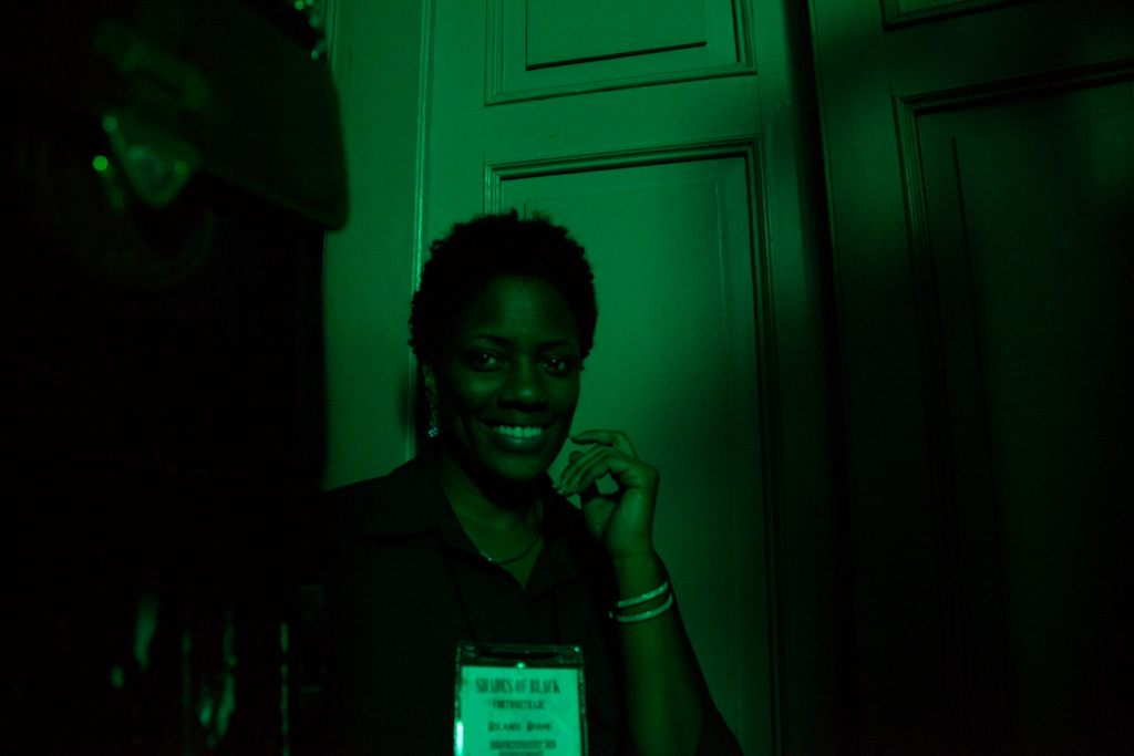
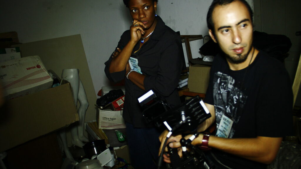
The Fabulous CrewFlim LocationThe Required PowerMy life-saving Art Direction CrewDirector & Supporting ActressSneaky photo of meCatalina (our director) being the dynamic woman she is..Another rare sighting listening me to our Professor, Bear BrownDirector make sure we are on trackI don’t remember this photo at allMy face says things were getting serious but really we had the best time.
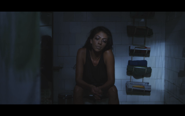
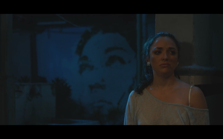
Our project was the brainchild of a brilliant director, Catalina Alcaraz-Guzman. The film, “Shades of Black,” explores the emotional journeys of two women at different stages of their careers in the world of performing arts. One was a jaded veteran, while the other was beginning her artistic voyage.
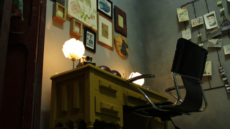
My role as the production designer was to create environments that would support the storytelling. I designed a moody kitchen where most pivotal dialogues took place, a bedroom where the narrative unfolded, and two contemplative courtyards where both characters grappled with the unspoken.
The beauty of Medellín seeped into our frames, enriching the visual narrative. The vibrant colors, picturesque streets, and photogenic settings served as a wellspring of inspiration for our artistic vision.
“Shades of Black” is a story that delves into the emotional depths of its characters. One has become disillusioned, wrapped in her self-indulgence, and captivated by worldly pleasures. The other is on a quest to shed her innocence and find her place in a world where art and life are intertwined.
As the days passed, I immersed myself in the story, intricately crafting each scene to support the characters’ emotional arcs. It was a crash course in resourcefulness and creativity, an experience that demanded making things work even with limited resources.
Medellín became a character in the film, its charming streets and scenic landscapes adding depth to the story. The city’s energy and spirit resonated with our narrative, amplifying the emotions of our characters.
Working in Medellín was not just a professional endeavor but also a personal journey. It reminded me of the beauty of my Caribbean home, the warmth of its people, and the power of storytelling that transcends language.
“Shades of Black” was more than just a film project; it was an exploration of the human experience, a journey of self-discovery and transformation. And Medellín, with its vibrant colors and photogenic sites, played a crucial role in bringing that story to life.
Ultimately, it was not just a film, but a testament to the universal language of art, one that transcends borders, cultures, and languages.
Shades of Black is a window into the emotional state of two women. One has become cold-hearted, wrapped in herself and the pleasures of the world. The other struggles to shed her innocence and yearning to be found.
Crew:
Catalina Alcaraz-Guzman – Director
Marcel Morschhauser – Director of Photography
Yolande Thame – Production Designer
Crafting Dreams: A Journey into the MFA Thesis Project
Venturing into the realm of an MFA thesis project is like embarking on a profound artistic odyssey. It’s a voyage that delves deep into one’s creative spirit, pushing the boundaries of imagination. Today, I’m thrilled to share a glimpse of my SCAD Production Design MFA thesis project, an exploration that took me on a transformative journey through the enchanting world of cinema.
Plot:
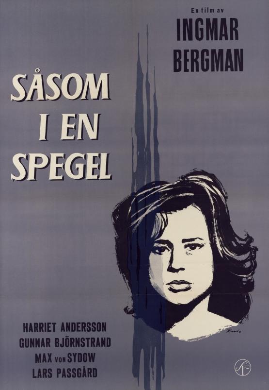
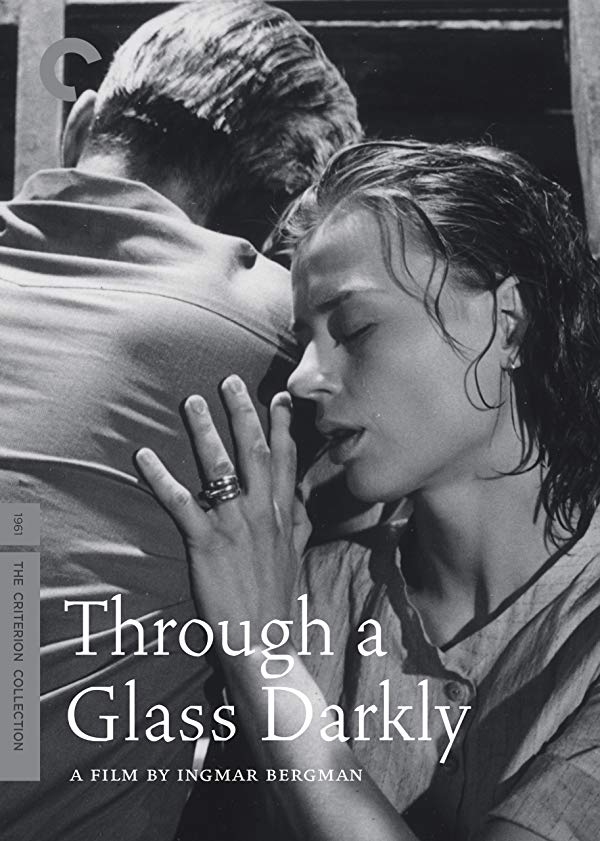
My journey began with the reimagining of Ingmar Bergman’s iconic film, “Through a Glass Darkly” (1961). This psychological masterpiece tells the story of four family members on a remote island vacation, focusing on Karin, who has recently been released from a mental institution.
Adaptation:
My mission was to infuse this narrative with a fresh perspective, moving the story from its original European setting to the vibrant tapestry of Jamaica. In this reimagining, a Jamaican family returns to their island home after migrating from Manchester, England, just before colonial emancipation in 1962. The house, once a place of refuge, had been locked up for several years, partially reclaimed by nature. Karin, entrusted with the task of revitalizing the space, grapples with her inner demons and experiences vivid hallucinations.
THE Concept:
The House:
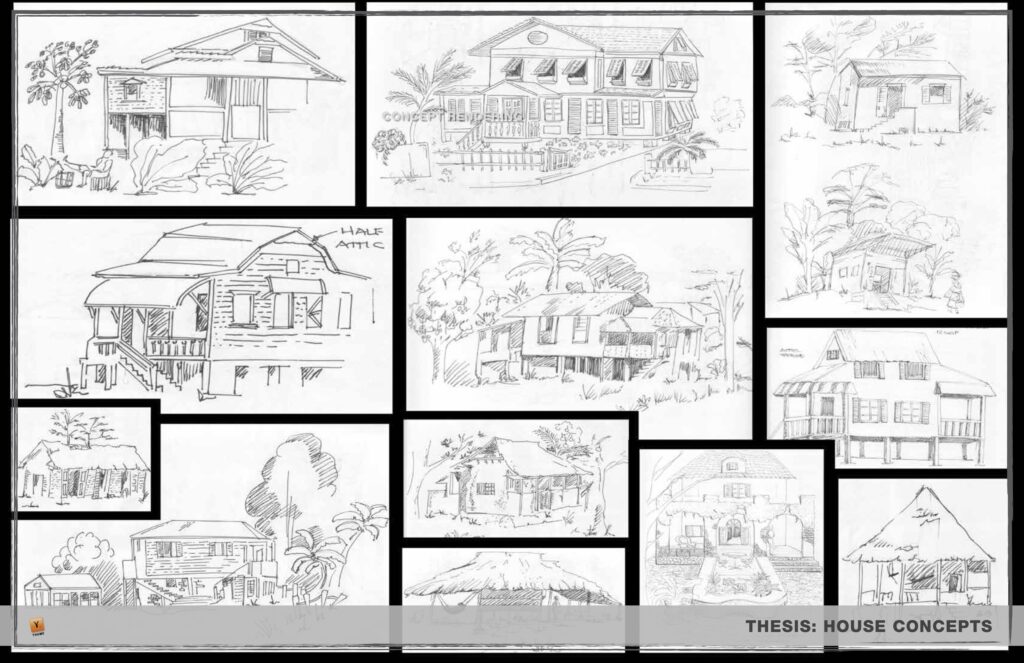
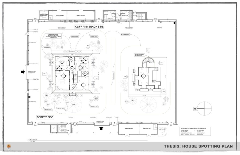
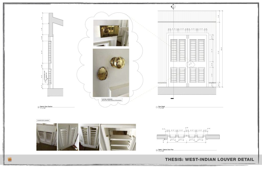
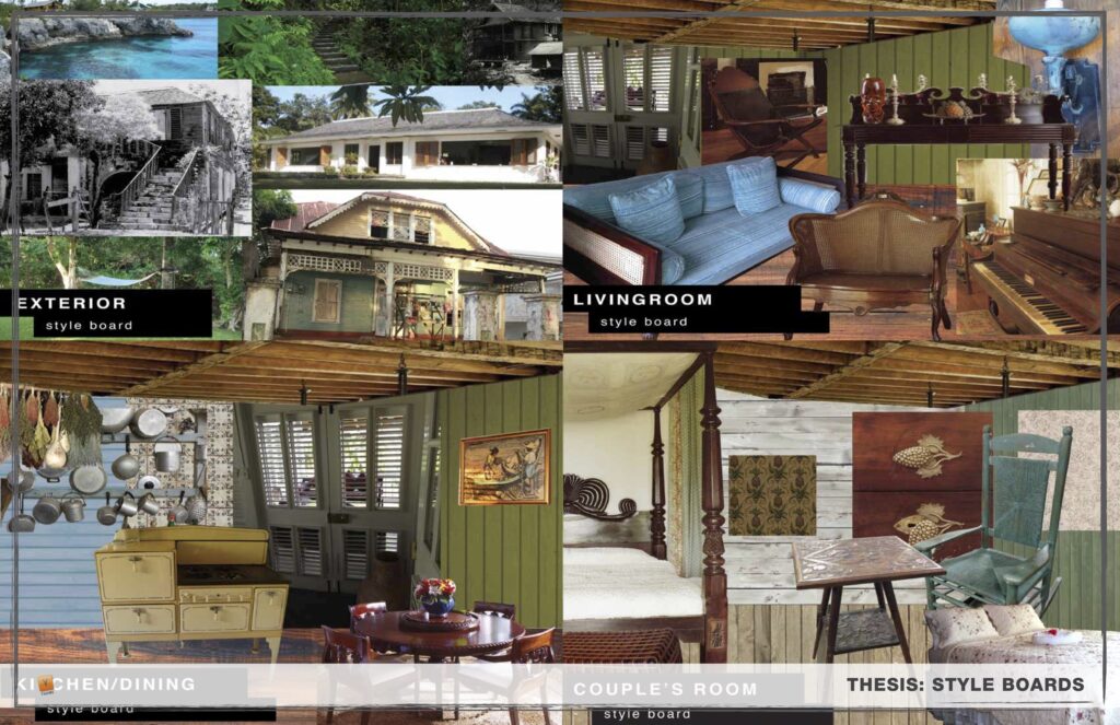
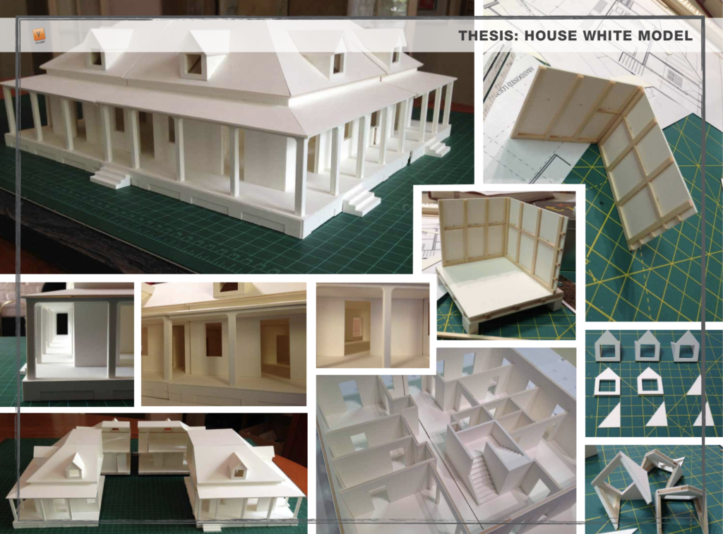
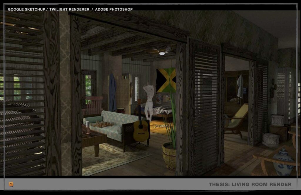
Central to the project was the transformation of the sprawling plantation house, slowly being devoured by the encroaching forest. Its faded, dry color palette symbolized its vulnerability and the toll of domestic life on Karin’s mental state. The wrap-around porch’s spindly columns hinted at the family’s French Creole heritage, leaving them exposed to the elements and one another. Inside, the house was a chaotic mix of colonial furniture, ancestral keepsakes, travel memorabilia, and symbols of island pride, reflecting the struggle to reconcile cultural and personal traumas.
Fantasy:
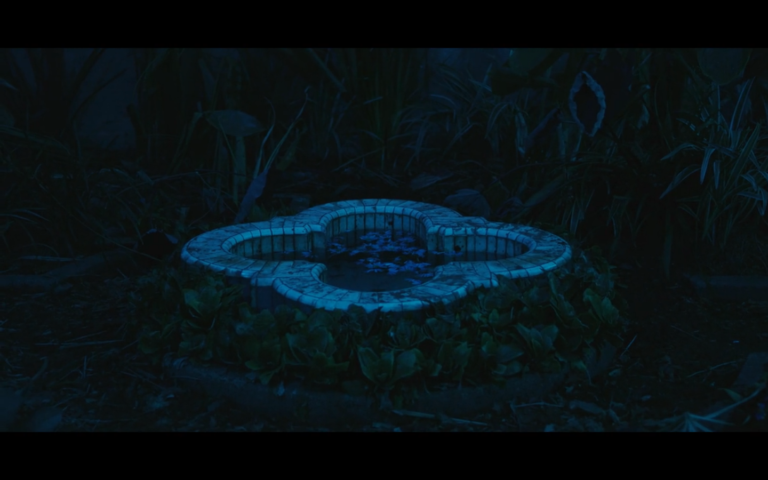
Karin’s hallucinatory journey led her to a dramatic Gothic-influenced hall where she confronted her deepest fears. High ceilings, obscured by undulating rosary windows, seemed to slither up the walls. Spider-like tendrils held antique wooden furniture in suspense, poised to move at any moment. In the center of this surreal space, icy water encroached from the flooded exterior, while luminous capsules containing matriarchal symbols floated in a wading pool. Karin’s interaction with this space initiated a profound transformation, shaking her psyche and the chamber itself.
The journey I undertook in this MFA thesis project was an exploration of storytelling through the lens of production design. It allowed me to reimagine a classic narrative, blending elements of the original with fresh perspectives and cultural nuances. The resulting vision was a vivid tapestry of colors, textures, and emotions that transcended the boundaries of traditional cinema.
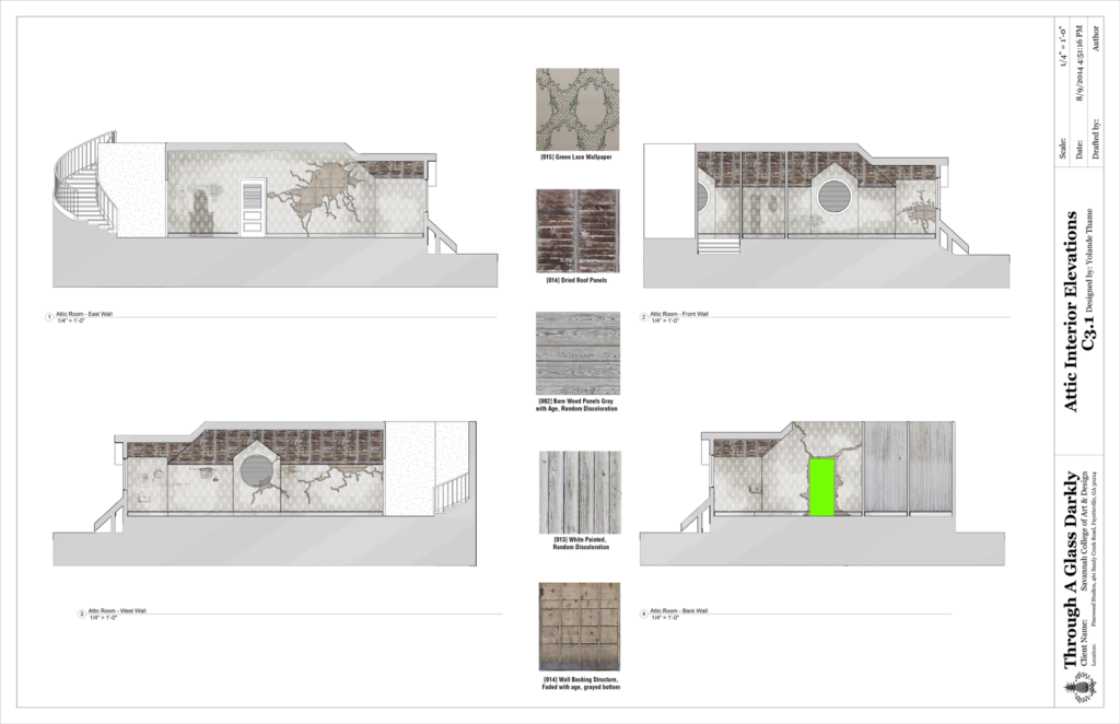
This project is a testament to the power of art direction in shaping narrative experiences, making it an unforgettable chapter in my artistic journey. While I can’t share the entire 150-page paper today, these presentation slides provide a glimpse into the world I crafted, bringing Bergman’s classic into a new light.
In crafting dreams and giving life to imaginative landscapes, I’ve discovered the boundless potential of storytelling through art direction.
Unearthing the Scenic Triumph in “Intolerance” (1916)
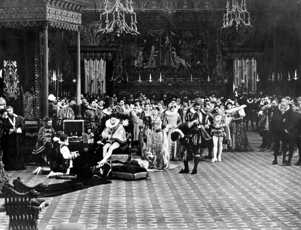
Director D.W. Griffith often remembered for his controversial film “Birth of a Nation” (1914), embarked on an ambitious project in 1916—”Intolerance.” This epic silent film, with art direction by Walter L. Hall, aimed to depict how hatred and intolerance have clashed with love and charity throughout history. While it may not meet modern Oscar criteria, “Intolerance” remains a scenic triumph that deserves recognition.
The film weaves together four loosely intertwined historical narratives: the Massacre of St. Bartholomew, the Capture of Babylon, the Crucifixion of Jesus, and early 20th-century American justice. Griffith intended to respond to the growing calls for censorship against his previous film, but “Intolerance” went beyond mere storytelling. It marked the beginning of a directorial quest for in-depth visual research to support narratives.
Griffith’s pursuit of realism in set design was evident as he immersed himself in extensive research before production. However, the film’s execution often crossed into exaggerated fiction. While most objects in the film were based on authentic artifacts from anthropological books, cultural motifs were mixed and matched to suit the frame. The Babylonian sequence is a prime example, with elements from various Near Eastern cultures.
Despite the historical inaccuracy, the film’s sets created a visual world that continues to influence modern films and contemporary architecture. The grandeur of Babylon’s Great Walls, adorned with massive archways, pillar capitals, and centaur statuettes, showcases Griffith’s significant contribution to modern scenic design. The scenes, particularly the storming of the massive set by invaders, were brilliantly captured.
The more contemporary settings in “Intolerance” were equally impressive, from stately ballrooms to the hand-tinted walls of the Louvre palace. However, what truly stood out were the small details that conveyed the characters’ status and authority, such as floral-print wallpaper and quaint sconces.
While the film excelled in creating an “accuracy” of time and place, it occasionally fell short in providing insights into the characters’ struggles. Thus, the final verdict for “Intolerance” on the Scenic Fitch Rating scale is four out of three scenic fitches.
“Intolerance” may not have received an art direction Oscar, but it undeniably left a lasting mark on scenic design, inspiring generations of filmmakers and artists.
Reference:
(1) Merritt, Russell, “On First Looking into Griffith’s Babylon: A Historical Investigation,” in Wide Angle (Athens, Ohio), no.1, 1979.
The Journey Towards Becoming an Oscar-Winning Art Director
Embarking on my career path has resembled a meandering journey, with twists and turns leading to unexpected destinations. My pursuit of the dream of becoming an Oscar-winning art director is a testament to this winding path. It’s a journey that has been both slow and deliberate, characterized by self-education and an unwavering commitment to my craft.
In a recent moment of introspection, I took a few hours to define my aspirations clearly. My goal is resolute: to become an Oscar-winning art director. This vision of my future is not merely a daydream but a meticulously planned destination. I envision a future where my approach to designing film environments is methodical and replicable, where my knowledge of historic architectural and costume progression is encyclopedic, and where I have access to talented and trusted crews, vendors, and resources. It’s a future marked by an ever-expanding understanding of what can be tangibly achieved for the lens.
But what is it about art direction that fuels my ambition? For me, it’s the profound impact of masterful storytelling. I believe that films, in particular, have the power to change lives and make people think in ways they never have before. Movies can plant intellectual seeds that transcend culture, literacy, and economic standing. The potential to create such impactful narratives is what drives me.
However, one question looms—what has held me back from pursuing my dream with unwavering determination? The answer, I candidly admit, is fear. The fear that my creative output does not yet reflect my exacting taste has, at times, paralyzed me. For years, I have shied away from showcasing my work, afraid of being judged for art that I felt was not ready for portfolio branding.
But today marks a new beginning. I am determined to shed my inhibitions and get to work. I am initiating several projects to sharpen my design skills, starting with a film review blog. This blog, unlike most others, will focus exclusively on evaluating films based on their scenic merits. I have curated a selection of 92 films officially celebrated for their art direction, with a primary focus on Academy Award winners.
By closely examining these cinematic classics, I hope to gain insights into what makes a film truly Oscar-worthy. Are there compositional, tonal, or thematic trends that are universally applicable? I plan to share my findings, inviting feedback and sparking lively debates on this often-underappreciated aspect of filmmaking.
The journey of becoming an Oscar-winning art director is not just a personal aspiration but an opportunity to inspire others to pursue their dreams with tenacity and an unwavering commitment to their craft. It’s a reminder that the road to success may be meandering, but each step forward brings us closer to our destination.